On most responsive websites, they’ll use a container that sets a maximum width on the content (see Discourse or Bang on 4k displays for eg). I can do this is there’s a desire to do so:
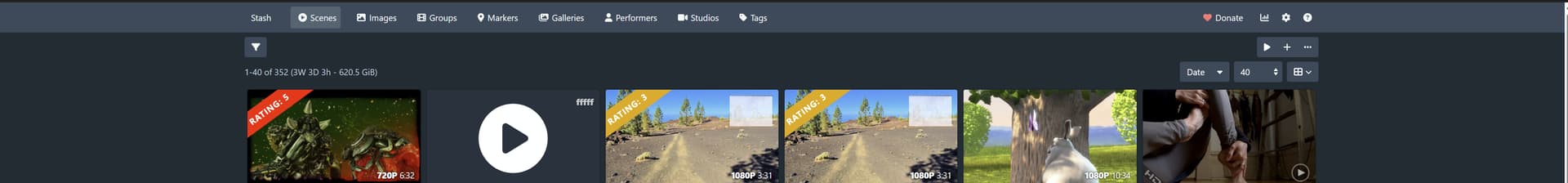
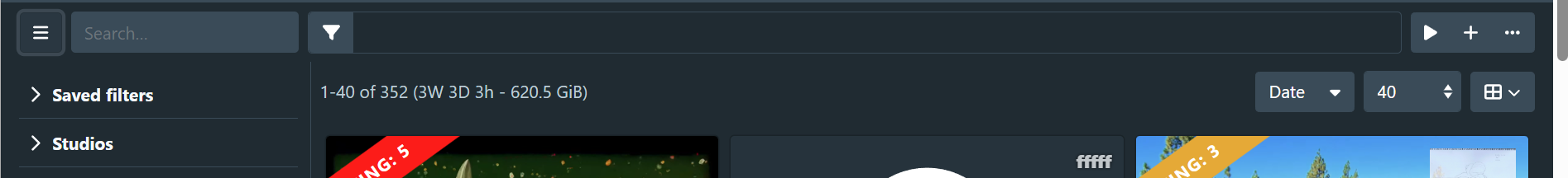
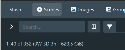
I personally like the full width content. My point is more about the horizontal space not being used and having a big empty gap between filter button and action/filter buttons. It’s even noticable on 16:9 1080p display.
I would prefer consolidating action row (play, add, more) and filter row (sort, per page, view) into a single row, but it needs to have logical separation between different groups of actions. And I’m not sure how to best achieve that.
We’ll see how it goes with the toolbar filter tag changes. It might be worth moving the filter tags into the toolbar completely.
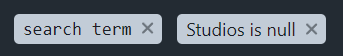
In the meantime, I’ve been playing with having a search term filter tag. Here’s what I currently have:
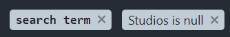
I styled it with monospace and bolded to distinguish it from the other filter tags. I thought having a regular font weight didn’t distinguish it enough:
I’m open to other ideas on how to display it.
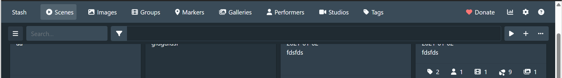
At first glance at the info provided in the PR, it seems like my feedback from Scene list toolbar by WithoutPants · Pull Request #5938 · stashapp/stash · GitHub still stands. I have a hard time understanding how that hole at the top of the page isn’t standing out as a red flag. There is so much unused space there that remains unused when scrolled to the top of the page. Additionally, more space is taken to below the menu to display the tag information. I imagine you opted to do this to account for the overflow scenario. But remember, this scenario is likely to be a rare occurrence for most users. So why subject people to the inefficient approach to account for this minority scenario? Aside from that, users like me who would have preferred to remove the sticky property using CSS to maximize real estate would no longer have an easy path to achieving this, since the implementation dictates that we only get the optimal version of that toolbar when the sticky property is activated.
After checking out your change locally, I noticed that the filter pills are actually present in both places by default.

I suspect this may be a bug, but I actually think this would be preferable. If both of those elements remain on the DOM, even if the element on the top toolbar display is set to hidden, that will allow an easy path for users to achieve a solution that may be more ideal for them.
Thanks for the helpful feedback as usual.
I’m going to take a stab and say that it’s likely a combination of staring at this thing for too long, and spending most of my time working with the stash window sharing half my screen with my IDE. The aspect ratio ends up typically in a portrait configuration which may be blinding me to some design issues. I may have to revisit how I have my development environment.
Sometimes the reasons for these decisions get distant and lost, but yes I believe that was the reason for having the centered and wrapped set of filter tags at the top of the screen.
It seems like the simplest solution would be to remove the second centered filter tag list and just have it in the toolbar without the visibility magic.
Edit: Here’s how it looks:

Haha yes, and sometimes attempts to solve one problem end up creating more.
It seems like the simplest solution would be to remove the second centered filter tag list and just have it in the toolbar without the visibility magic.
Yes, this would be much simpler.
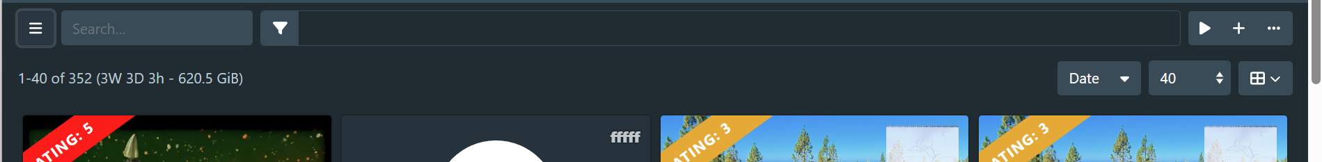
I just got around to playing around with the overflow implementation you have. I gotta say, it is perfect now that it can dynamically determine when overflow is needed rather than overflowing past a fixed number of tags. I can’t imagine you were trying to hide that in favor of the previous implementation.
1 Like
By the way, I just caught that the filter button now expands the sidebar, and the sidebar has a new button to access the full list of filters. There will likely be some growing pains here since users are used to that button revealing the filter list. I had a bit of trouble at first figuring out how to access that menu. This change may be worth an announcement prompt in the UI after users make the update in the next release.
1 Like
Crossposting from Github so CJ can reply again:
In response to your question, I think something as simple as adding the magnifying glass SVG would suffice here (See image below). Also, the clear text has been feeling a bit out of place with its current styling. In the image below, I attempted to fix this by replacing it with a proper button that should convey the intended point. The button can display the “Clear” text on hover.

I’ll give this a shot.
Hey sorry for the delay in forwarding this feedback. Today presented a few unexpected fires that needed to be put out. Here is my most recent feedback on the GitHub PR, which relates to my earlier feedback above
(Show filter tags in scene list toolbar by WithoutPants · Pull Request #5969 · stashapp/stash · GitHub)
It’s basically an add filter button. The placement of the “Edit Filter” button, along with the name assigned to it, gives a wrong impression.
The action for the current Edit filter button doesn’t really match the action inferred by a + symbol.
The “Edit Filter” button really added filters to the list as well as to the new filter bar. Users also know they can click on the filter pill to edit that existing filter. Which makes the purpose of the “Edit Filter” button more confusing. Perhaps your comment is also related to the fact that the window is called “Edit Filter”. I think that name could be simplified to Filters
Users pulling this change for the first time will see the familiar filter button and press it, attempting to open up the filter window. Instead, they will see the sidebar, thinking this is the replacement for the filter window. Then they’ll notice the sidebar is very limited compared to the filter window they’re used to and wonder how to access the missing filter options. They will see the “Edit Filter” button and think it might be a way to expand the filter options on the sidebar, only to find the old filter menu instead. I’ve gone through this cycle a few times myself despite my involvement in the redesign.
The inclusion of the add filter button on the filter toolbar should eliminate this multi-step cycle. It should be clear that the button is used to add filters so users can quickly find what they are looking for. It’s also right next to the button users are used to clicking, making it easier for their muscle memory to adjust. Users will then wonder what the old filter button does and find out it reveals a pinnable filter menu with additional smarts not offered in the original sidebar window.
This addition should alleviate the need for the walkthrough guide, which I mentioned might be required for users pulling this change (here). I think this addition would save a bit of trouble for users consuming this work for the first time, having to adjust their muscle memory. It will also be invaluable to users who prefer to have the sidebar closed when possible, as they would no longer have to open and close it to add filters.
I disagree with this. The “Edit filter” dialog is for editing the current filter. It’s purpose, in contrast to the filter sidebar, is to fine-tune the current filter. It’s intended as a more advanced way to filter the results. See also: Edit filter dialog redesign
I don’t really follow that the Edit filter button is unclear in its intention. I don’t really see how it would infer expanding the existing options, but perhaps I’m misunderstanding what you mean.
The initial view that most users will be introduced to will be with the sidebar open - assuming they are running on screens that can accommodate it.
I do think that the sidebar toggle button in its current incarnation is the main source of confusion here. I agree that users will likely be confused by the actual action of the button vs the implied function. I disagree with the apparent function of the Edit filter button, and I’d want further data on that.
I suspect that the solution to this will involve re-solving how to toggle the sidebar and the current filter button becoming edit filter button, which will maintain consistency for existing users. I’ve been prototyping other ways to toggle the sidebar and haven’t settled on anything suitable so far.
Onto your proposed solution: I’m still of the belief that the + symbol is as misleading as the current implementation. I’m also pretty unhappy with how it looks when there are no current filters applied:
![]()
This will be the initial view that users are presented with, and I don’t think it improves clarity over having a specific Edit filter button.
I disagree with the apparent function of the Edit filter button, and I’d want further data on that.
It sounds like our misunderstanding is due to how we interpret the action that takes place in that window. It sounds like you see all the actions that take place there as a modification of a single filter, which would explain why the menu is currently Edit Filter rather than Edit Filters. I’ve always viewed that window more as an Add Filters menu, where I choose a variety of filter options to narrow down the content. The fact that each filter applied creates its own filter pill rather than all of them living in one pill makes the reference to all the actions that take place in the window in a singular form confusing to me.
I think you are leaning on the fact that users have been aware that the filter menu was called the Edit Filter menu, which would make it clear what that button does. In all my years of using Stash, I never internalized that Windows name until now, when we started having this conversation in order to understand where you were coming from. Perhaps some users did, but I suspect many didn’t because nothing about that name at the top draws users’ attention. This isn’t a bad thing because that was never meant to draw attention. I’m surprised we bothered to give these windows names.
I do think that the sidebar toggle button in its current incarnation is the main source of confusion here.
I don’t think there is a design issue with the current implementation that sees that button toggling a sidebar. I have seen other sites use that button for the same action. And I quite like its use as a button to open the sidebar rather than having a dedicated button for this. With the existence of that filter bar, it seems like low-hanging fruit to enable adding filters to that bar directly from the bar. You can edit filters from the bar and even remove filters, but why not add filters?
I’m also pretty unhappy with how it looks when there are no current filters applied:
I don’t disagree that, with that design, the button doesn’t look great in isolation. The design may be tweakable in a way that makes it more appealing in isolation. again though, I don’t want this discussion to hang up the progress of this work.
Gonna throw in some of my thoughts because design isn’t hell enough lol
I think if this is going to expand to other areas (e.g. performers) at a later date, we may need to reconsider some things for consistency sake.
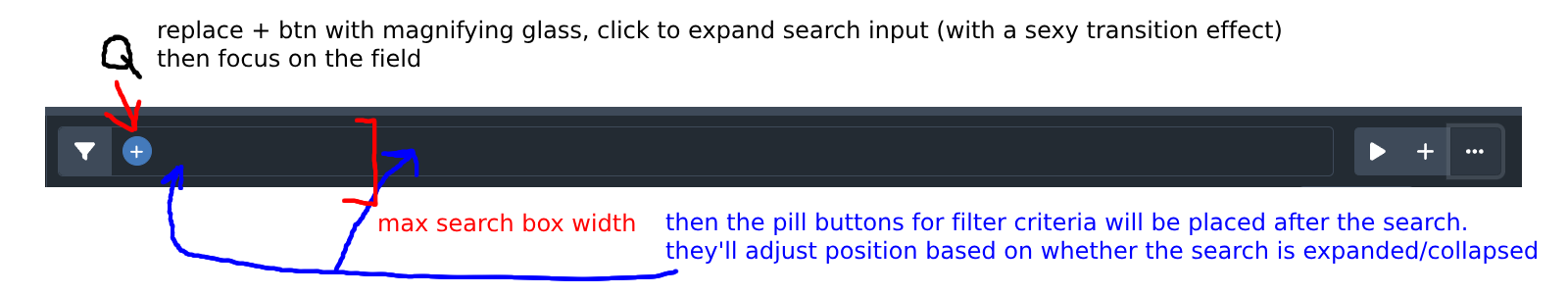
1.) I think it’s going to be more useful and commonplace to have a search box in that sticky bar. The search, in my experience, is incredibly useful. When I look at designs here, the search is always available to you in some fashion and isn’t hidden behind a drawer. Even if that means a clickable magnifying glass that expands into an input field, that would be valuable.
2a.) I definitely agree that the Filter button opening the sidebar should probably be re-worked. Users have an expectation with that button already to open the dialog. Personally, I don’t see a harm in re-adding the menu button to open the sidebar. Technically, the sidebar could do more things than just quick filtering if we decide to revisit it at some point. Plugins could potentially fill a gap here if desired. The sidebar doesn’t have to exclusively be a filtering component, in my opinion. I say let it be a menu with quick filtering options (so, its current state) and let plugins do the rest.
2b.) Personally, I have no use in the sidebar as it is. I’m a user that’s going to be content using the filter dialog 100% of the time because that’s what I’m used to (which is why I advocate for it to be in the sticky bar as well in some fashion). I expect others to use the sidebar, but for folks like me that see it as a “now I see one less result per row” I’ll need other functionality to make it worth it. All of this to say again – let it be a menu with different tools/functionality. I think designing it as a filter-only sidebar is causing the headaches. When all of those filter categories are rolled-up, there’s a lot of empty space anyways. Plugins, baby.
Based on the screenshot WP posted, this is what I’m thinking:
Edit for clarification: The menu button would be to the left of the filter button, and the filter button would open the dialog.
Thanks guys. Good discussion as usual.
I’m happy with the state of the current PR as is, but that doesn’t mean the work (or discussion) is finished. I can always open more PRs.
Fair point. I’m not against this concept completely; I was just unhappy with how the proposed design looked, particularly when there are no current filters. I think there’s room to workshop this further.
Clicking on the filter button currently opens the sidebar and focuses the search field. I think this covers that use case pretty thoroughly. The only real regression I see is that the user needs to click on the button again to hide the sidebar, but I think this is fairly similar to your suggested search button into search field mechanism. I think having a separate search field button would be redundant. I’ll defer this for further data/feedback.
I’d love to hear a bit more about this. Specifically, what features are going to have you reaching for the filter dialog rather than the sidebar? The sidebar is pretty sparse at the moment of course, but I’m very much interested in what will make users be steered more toward the sidebar.
This is a decent point as well. When I original envisioned the sidebar, I figured we would repurpose it for the batch edit workflow when items are selected, so this is a factor as well.
Fair, but I think there’s a chance users will be wondering what happened to the search, and new users won’t have that first instinct to open the sidebar to get to it. I really think there should be a search visible – even as I’m scrolled down on this page there’s a search icon next to my profile picture for that accessibility. I think it’s just a design convention at this point. If you’re saying it’s redundant to have a search box on the sticky bar and the sidebar, I meant removing it from the sidebar and having the search on the sticky bar only.
The edit filter dialog has more functionality. I can pin what I normally filter by, it has more options, I can use the search to find a filter, the filter criteria pills also exist there. It’s just an all-in-one place where I can get the job done and it’s more reliable because of that. If I open the sidebar and it’s missing “Orientation” or other filters, in my mind I’m thinking I might as well commit to using the dialog.
I think the sidebar doesn’t have to do all of those things though. I think it’s fine to have quick filtering like it is now for the main objects (tags, performers, studios, etc.), but more functionality besides filtering would have me opening the sidebar. Also, the prettier it looks, the more likely I am to keep it open. It could use some more icons or images instead of being completely data driven (I’m curious if those arrows replaced with the appropriate icons (studios, tags, etc.) would look better along with up/down arrows to the right).
I picture the sidebar being more feature complete with additional tools or information beneath those quick filters. I have lots of ideas for cool things plugins could do here, but out of the box:
1.) I think sections like “Quick Access” and other object-specific (scenes, performers, etc.) functions would be beneficial, where users can pin anything from their favorite scenes to something they want to watch later.
2.) While I don’t use it, there could be some stashbox related utility here I’m sure folks could get use out of.
3.) Like you mentioned, bulk editing could be great here. I think having it in the sidebar could be great instead of inside a dialog because sometimes I may need to click out of the dialog to verify something about a scene.
At the very bottom, you could have the amount of results returned, how much storage the current filter is using, whatever stats you want. Icons with the stats would help it pop. Below this could be a Customize button similar to the front page where you can re-order/add/remove specific sections.
Sorry, I try not to comment directly on other people aside from WP’s messages here, but I wanted to share some thoughts on this.
I really think there should be a search visible – even as I’m scrolled down on this page there’s a search icon next to my profile picture for that accessibility. I think it’s just a design convention at this point.
It sounds like the convention you are referring to here is a global search, which I agree Stash should support. Aside from the global search, it is rare that sites would make an additional search button always visible somewhere on the page. Sites I’ve seen with list text query functionality, as well as a sidebar, include that search box in the sidebar. The search box in the sidebar is inherently another filter for the list displayed on the content page, making its inclusion in the sidebar appropriate to me. The search box should be visible to users when they first pull this change, as the sidebar is currently designed to open by default on desktop displays. I haven’t had a chance to test Search term filter tag on scene list by WithoutPants · Pull Request #5991 · stashapp/stash · GitHub yet, but in that PR, I think it would make sense that clicking the search pill would activate the search box in the sidebar, the same way clicking other filter pills activates their filter entry in the menu.
The additional functionality the sidebar brings compared to the filter menu is its accessibility, as well as the knowledge every filter option has about each other to determine when a tag or performer should not be shown, given its relevance to the current active filters (see Filter performers/tags/studios list by current filter by WithoutPants · Pull Request #5920 · stashapp/stash · GitHub). I think the ideal scenario with the sidebar is that users would be able to pin whatever filters they want to it. To compensate for the current lack of this feature, WP has made that component patchable and has updated the models to make including filters via plugins as easy as possible. Of course, it would still be better to make additional filters pinnable without plugins. Additionally, for this reason, I don’t think it would make sense to include icons like those from the scenes or performer pages in this window, as we wouldn’t have icons for everything that could be pinned to that area. Regarding making that area prettier, though, I did think the big blue button in the window was a big offender, which was one of the reasons I proposed pulling it out in a smaller form.
5 posts were split to a new topic: Global search
Haha, perhaps we got a bit off-topic with the focus on the global search implementation. I certainly wasn’t suggesting that be implemented as part of the filter work going into the coming release. On the topic of the upcoming release, it recently occurred to me that the filter button, which is now used to open the sidebar on the scenes page, still opens the filter window on the other pages. I would hesitate to release these changes with that disjointed messaging intact. I think we should either push the toolbar refactor to the other pages before the upcoming release or rework the button function to match the same behavior as on the other pages. As I’m now well adapted to the behavior change and don’t utilize filters aside from the search filter on other pages, I’d lean toward holding out on a release until this change can be consolidated.
Edit:
It’s also possible I’m overthinking this.
I took the liberty of splitting off the global search discussion into a separate topic, to keep things on topic here.
I agree with this and I don’t think you’re overthinking it. Having spent some time with the new UI, I’m still a bit unhappy with the current design.
Agreed. This needs further reworking.
The first thing that needs to change is that the filter icon needs to open the filter dialog, to be consistent with other query pages.
I’ve also come around to QxxxGit’s take on the search input, quoted below:
That last sentence is important, and suggests putting it in the sidebar is probably not ideal.
I’m trying out a design where the sidebar appears under the query toolbar, so the toolbar extends all the way to the left side. I re-added the search input to the toolbar and made the filter button open the filter dialog. I then needed to figure out where to put the toggle sidebar button, a problem that has been plaguing us since the beginning of the design.
We want the button to be located close to where the sidebar opens, and ideally it should be grouped with the rest of the search controls. I just can’t seem to find a good place for it. Here’s some screenshots where the sidebar toggle is on the left-most side.
Sidebar open:
Sidebar closed:
Sidebar closed, page scrolled
One using minimal styling:
With a chevron icon:
Moving the toggle button to the right of the search input:
I think the overall look is a lot more consistent with the other query pages, I’m just not happy with the placement of the sidebar toggle button.
We could also potentially have the search field collapse into a query button, but I’m not sure if it would help the overall design or not.
What you have here does not look good. That area is too busy. This is why I was hoping we could avoid opening that can of worms. You said it yourself earlier. Having the search input on the toolbar is redundant. In both implementations, the number of clicks required to query remains the same at one click. I don’t see what was solved here aside from adding more clutter.
The issue I mentioned about the filter button was a temporary issue that would have solved itself once the work was consolidated and the user base had adapted. You introduced something very unique in your implementation of the toolbar. The hope was that any solution we provide to the filter menu or even the search bar issue would lean into the toolbar you’ve created to add more value to it. Your recent change deemphasizes that work. Qx’s suggestions of keeping the search pill always visible on the toolbar would have been preferable.