Rolling out this change to the other pages will push back the release significantly, and potentially means having to solve design issues on all of the query pages at once rather than one. I don’t think it’s a good option.
Another option we could consider if we want to maintain some synchrony with the filter button’s behavior is to consider only showing the add button I suggested earlier (see image below) when the user mouses over that filter area. If we do that, that button would need to always render after the clear button to avoid element shifting when attempting to interact with that area. This would guide the user, letting them know this is what they are looking for. When the user eventually clicks the filter button, what they see is still an extension of the filter menu they were used to, without the big blue button.
That aside, I don’t think it’s unacceptable to take time to work this out across pages before the next release. Once we have sorted out the design on the scenes page, I don’t mind helping to port this work to the other pages.
I think there’s a definite need for the ability to open the filter dialog without having to open the sidebar. Moving the “show filter dialog” action from the sidebar into the toolbar is the right direction I think.
I think the action to edit the current filter should be obvious to the user, and my concern with this is that it would obfuscate it.
An alternative to the suggestion above would be to provide the button in this deemphasized form and fill it out on hover:
In this form, we can keep the add button left of the clear button. Keep in mind that in both solutions, the button will be present on the DOM, leaving it easily accessible for CSS edits. In the earlier suggestion, a user could easily decide to keep the button present at all times once they have learn that the filter menu can be accessed there.
Not to dig into the global search topic again, but since it’s loosely related: I do agree with this, but since we do not currently have that functionality, there should be a search visible on the page and for now the filter search is viable on the sticky bar until a global search becomes a thing. At that time (much later I assume), I suspect the current filter search will be pushed into the sidebar anyways.
If we push the search into the sidebar right now, the inconvenience users like myself will have is ultimately small so it’s not the end of the world. It’s just going to be weird at some point going to Performers → click button to open a big sidebar just so I can search for a specific performer. And if I’m searching for something specific on the Scenes page, I’m going to be forced to keep the sidebar open in case I need to jump back to editing the search input. Like I mentioned before, the sidebar needs more oomph to validate its existence for users like me.. so it’s a waste of screen space until then.
@WithoutPants don’t let me or this concern get in the way of release. If you determine that it’s ideal to put the search in the sidebar because it will be done much later anyways, you do what’s going to cause you less headache, and so we can get this release out. I think this release will be fine as a test run to get feedback from users so you’ll get more input than just the few of us. I agree with you that we shouldn’t push this change onto other pages just yet. There’s too many unknowns/uncertainties for that.
If you decide to keep the search in the bar, and I had to choose one of your screenshots, the minimal styling looks cleanest to me. I don’t think it looks busy at all.
I have a very large database, and my hobby happens to consist of polishing this database when I can. The value of these tools is not lost on me. You can’t just spill all the tools on the table for the sake of convenience. Perhaps you can if you don’t mind a mess, but it is good to have a clean workspace. To achieve this, you have to put some tools in a drawer and pull them out when you need them. I don’t think there is an expectation that users will just always keep the sidebar open. Even though I don’t mind it, my sidebar is closed 90 percent of the time because I’m not always in need of query tools. When I do need it, the amount of effort to start a search is the same as it was when the text input was always in view.
When this work is released, I fully expect there will be growing pains. Most don’t adapt well to UI changes. What was done with the sidebar is not novel. It has been tried and tested by some of the largest sites available.
We simply have different use cases. My database is infinitely smaller than yours but I spend a significant amount of time doing manual data entry, from creating performers to updating images and galleries.
Using your analogy, if I’m frequently using a tool, it doesn’t make sense for me to keep putting the tool in the drawer when I’m going to be pulling it back out within the next 5 minutes. It also doesn’t make sense to keep that drawer open if it’s getting in the way of fully utilizing the workspace. The tool is smaller than the drawer. Even multiple tools is smaller than the drawer. I disagree that a search box is ‘spilling all the tools on the table.’ That’s a bit hyperbolic. The existing toolset on other pages has even more tools and it’s not that messy. I use the search equally as much as I use the filter dialog.
Again, I will defer to WP for his decision on this since it’s his time being spent, and I think him getting more feedback after release will be better than being stuck in limbo.
I disagree that a search box is ‘spilling all the tools on the table.’ That’s a bit hyperbolic. The existing toolset on other pages has even more tools and it’s not that messy. I use the search equally as much as I use the filter dialog.
In the original design, users weren’t holding these tools with them everywhere they went. To use them, they always had to return to the top of the page. You were either consuming the data or querying the data. You really couldn’t do both simultaneously. The speed at which you can access the search input has actually improved in the current design.
Because these tools weren’t always in view, we organized them into four rows at the top, which allowed us the ability to keep the presentation tidy. We basically had a bigger table we could afford because we weren’t carrying it everywhere. That is not the case here. We are talking about trying to fit everything in that one row that users take everywhere. The search box is not a small thing. WP’s attempt to fit that box in the table earlier made that space far too busy. Keeping the search pill on the toolbar, IMO would have been a better solution. It wouldn’t have to open up as a full input box when pressed. The best implementation would be to allow the pill to dynamically grow as the user types into it. This would be fine, IMO. But this doesn’t actually make getting to that tool any quicker. You still have to open and close (or click into it and click out of it) just the same, which was the same experience on the other pages.
Going back to the value point you made earlier about the sidebar. I agree that for some users the sidebar may not bring enough value. Allowing users the option to choose which tools they want in the drawer I think would help solve the value problem. Plugins could then incorporate whatever non-filter related tools developers can come up with.
Personally, I think the new UI with the top bar being sticky is a significant improvement for anyone that is doing any amount of manual updates. I’ve always found it a chore to select one or more entries on the page and then scroll back up to the top to click the edit button, and this change improves that workflow tremendously.
I do find the value of the sidebar is a bit questionable at the moment, but I do overall think there’s more good than bad in the redesign.
There are a few ways this could be tweaked, but I can touch on that later. Keeping with the search pill idea, this is what the bar would look like before a query is initiated.
I’ve made the pill and text slightly larger than the other pills so it stands out a bit more (we might also consider bolding that text). I’ve also added a subtle border to the right of the search pill since it behaves slightly differently from the other pills that will populate that area. Also, the clear button likely won’t apply to that pill. Since the search pill is larger, the current CSS rule causes the other pills to grow in height to match that search pill. If we want to prevent this, we would add the following property to the span element of the pills: margin: auto 0;. This makes it so that the height difference will be accounted for via a margin rather than the span itself growing in height.
When the button is pressed, there are a few things we could do:
We could implement the growing text pill idea I mentioned earlier (here is a Stack Overflow post on that).
We could expand this area to a set width, as you would see in our previous text input boxes.
We could provide a text input box as a drop-down.
Either of these approaches would probably be fine.
Once the pill has been populated with a search term, it would look like this:
If we then also provide the add filter button to this area, as I mentioned earlier. All queries can be done without touching the sidebar. The sidebar would serve as a pinable shortcut to specific filter options (which the user would ideally be able to select themselves), as well as saved filters.
Apologies for the lack of updates on this. I remain really sick, and spending time on this is difficult currently.
I remain unconvinced regarding the action of the filter icon. In addition to the inconsistency with the existing behaviour and that of other pages, I’m also of the belief that it paints us into a corner regarding the purpose of the sidebar, which will likely be expanded in the future. Keeping the filter icon action as showing the filter dialog also eliminates the need for an Add filter button and the Edit filter button in the sidebar. It does mean that we need to re-solve the sidebar toggle button icon and placement.
I like the idea of an expanding search button/pill.
I like these approaches the best.
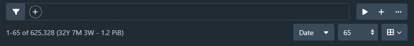
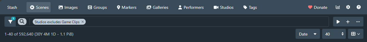
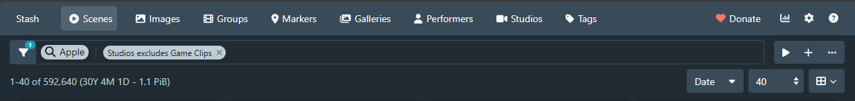
This is what I have prototyped at the moment:
The filter button opens the dialog. The sliders button on the right side opens the sidebar. I didn’t feel that it fit well on the left. The positioning is not ideal, but I do feel like it fits better.
Taking the search input field and Edit filter button out of the sidebar does leave the sidebar looking a bit off against the content:
I think it probably needs some sort of header, probably with a collapse button. Alternatively, the sidebar could open under the filter toolbar, per my earlier prototyping.
I wasn’t aware you’ve been under the weather. I hope you feel better soon.
I’m much happier with what you have here. I do agree that the positioning of the sidebar button isn’t ideal, but perhaps the sidebar shortcut key somewhat mitigates it. Also, since the search bar has been removed from the sidebar, the sidebar shortcut can now be toggleable to expand and collapse the sidebar.
I don’t think the sidebar looks off against the content. I think you’re eyes were used to having the search bar there and are just adjusting to the change. I already prepared myself for this adjustment as I knew I would encounter the same issue. Since the side will eventually contain more than just filter options, headers for the sections may be appropriate. I’m not a fan of the idea of placing the sidebar below the toolbar. I think it will do more harm than good.