After using this, I really like it. One caveat is that the dropdown doesn’t disappear after the option is selected. That seems inconsistent with other dropdowns and I can’t see a good reason for the inconsistency.
Hey Dogma, I had a hard time parsing out what the problem was here. When I interact with existing drop-downs, the chevron remains visible after engaging it. Which drop-down in the existing UI did you see disappear?
He means when you make a selection in a typical dropdown, the list then disappears. In the display mode selector the list stays visible after selecting an item. I don’t think I did this intentionally.
Ah, good eye. Thanks for clarifying.
I don’t think there’s room to show filter criteria in the toolbar on mobile devices. I think it’s more important to have access to the other buttons on these smaller viewports. We can have the filter criteria at the top of the page per existing behaviour, and ensure we have the count badge in the filter button. This is the rough idea:
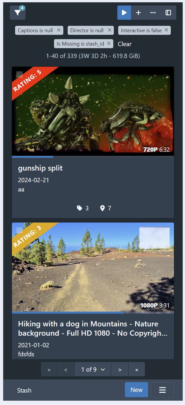
In any case, I’m going to push the filter tag stuff into a PR separate from the rest of the toolbar stuff, since whichever way we go, it’s a chunk of changes on its own. For the time being, I’ll leave the filter tags at the top of the page.
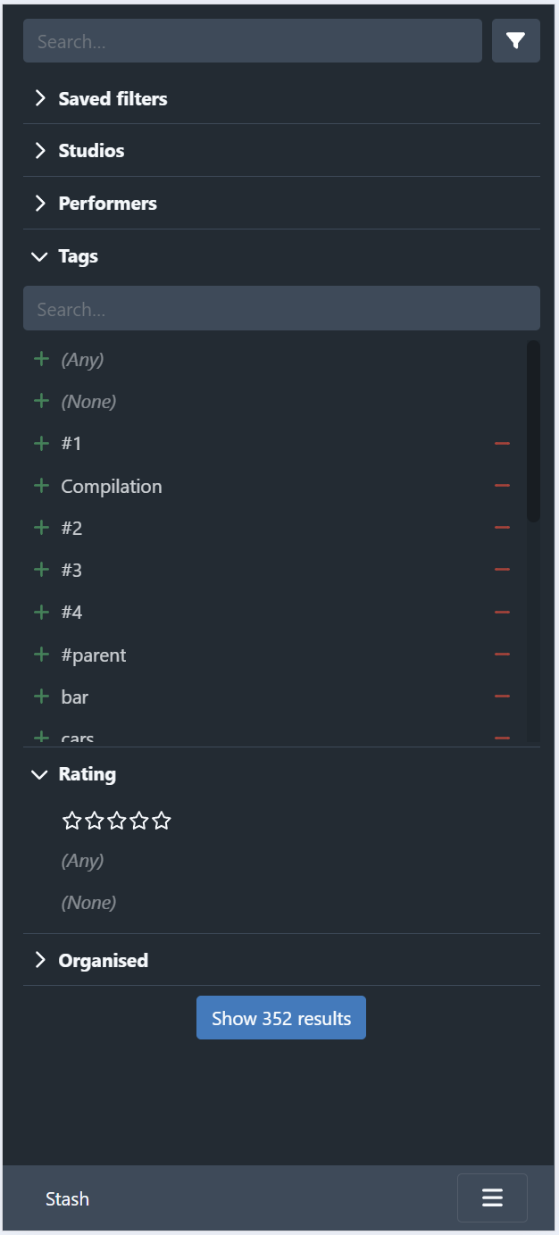
I’ve been working on the presentation for mobile viewports. The current state is much like the above screenshot (I’ve yet to add the sort/page size/display mode controls back in). The sidebar currently looks like the following:
The button to close the sidebar is at the bottom, showing the number of results. It sticks to the bottom of the page:
An alternative is to fix the close button to the bottom of the screen:
I probably prefer this positioning as it gives the user a fixed (and easily accessible) place to close the sidebar. It needs a bit of css hacking to get it positioned correctly though.
Having the filter button on the toolbar and the sidebar feels a little redundant on mobile screens, and I suspect it might also be a cause of confusion for users. I’m not sold on having the filter button open the sidebar, and only have access to the edit filter dialog via the sidebar, as it adds an extra click for users that want to edit the filter directly. Ideally, the sidebar would cover 90% of the use cases for querying, with the edit filter dialog covering the remaining “advanced” cases. It’s not there yet, so perhaps when its like this in practice we can consider changing the flow on small devices.
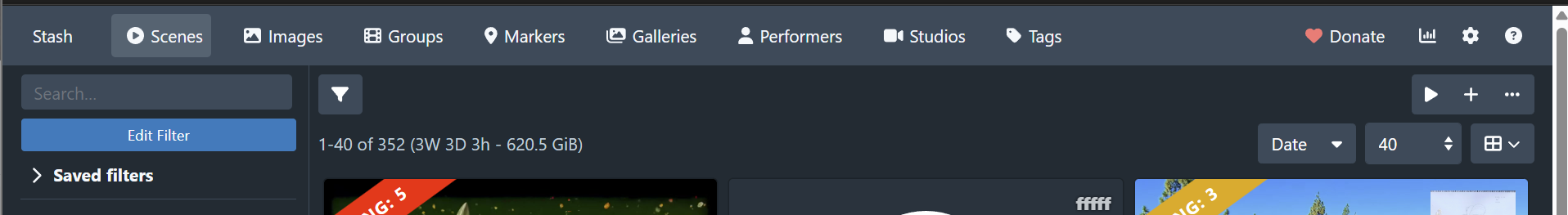
Alright, I think the first draft of the next PR is good to go. I added the header with sort/page size/display mode selectors.
I am tempted to left justify the filter tags since its the only thing at the top now that is currently centered. Here’s how that looks:
On the mobile viewport, I reversed the wrapping so that the result summary is placed underneath the display options. Here’s how it looks currently:
And this is how it looked without the reversed wrapping:
Further tweaks
The alignment of the results summary and filter tags still looks wonky to me. It should probably either both be left justified or centered on small viewports.
I haven’t yet styled the buttons in the minimal style of the original design. I’m a little concerned with making the buttons styled differently in the scenes page from the rest of the UI. It might be worth deferring changing the styling until this is rolled out to other query pages.
Addendum
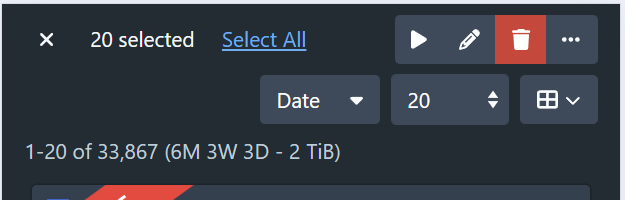
Forgot to attach screenshots of the selection toolbar:

PR here.
Continuing the discussion from the PR:
In practice, the experience of clicking the expand sidebar button on the far right, then mousing over to the far left to use the sidebar is not great. Keeping @echo6ix 's suggestion for the sidebar button, which fixes the button to the top left, would work better here.
I think this highlights the redundancy of the edit filter/toggle sidebar visibility buttons. I think the solution here is to make the top left filter button toggle the sidebar and move the Edit Filter button into the sidebar:
I mentioned above about my concerns with this approach:
If we can cover frequent use cases, then I think moving the edit filter button to the sidebar should be ok. The edit filter dialog will also remain accessible via the existing filter tags.
I can live with having the filter button open up the sidebar. I am a bit hesitant about the idea of limiting filter capabilities on mobile. I myself rarely use specific queries on mobiles, but I imagine some users do. I see your point, though. The filter menu and the sidebar would look very similar. I can live with limiting the capability on mobile, but I would expect some unhappy users. I saw that you’ve already made the sidebar patchable, so perhaps plugins can step in to expand the filter options.
Going back to your post about the mobile design. I agree the alignment is wonky. Here is a mock-up for mobile I put together to fix some of those issues:
Moving the operation buttons to the header row (instead of the sticky toolbar) on mobile is a little finicky. I had to hide the buttons in the toolbar, then show a separate copy on the header row (this copy had to be hidden on non-mobile viewports). Ideally, the operation buttons should be visible in the toolbar when items are selected (in which case the filter info will be hidden), but this meant having duplicate buttons in the header when selecting items. I tried hiding the second set of buttons when items are selected, but it’s a little dinky.
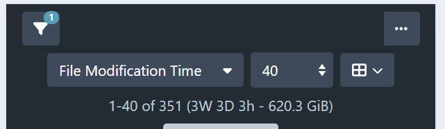
It also wouldn’t fit when a longer sort by was selected (eg File Modification Time).
I’m thinking to move the create and play buttons into the overflow button on mobile:
This gives us enough space to still show the filter information, while still having access to those operations.
Moving those buttons into the overflow makes a lot of sense here, where we don’t have as much real estate. It also achieves closer parity to the layout we have on desktop. That gets a thumbs up from me  .
.
1 Like
I’ve been running with these changes in my personal system for a few days now and I’ve been mostly happy with it. I pushed a change to increase the size of the sidebar controls on mobile, as these were a bit small even for my dainty fingers.
I made a separate PR (Give bottom pagination bar transparent background by WithoutPants · Pull Request #5958 · stashapp/stash · GitHub) to make the bottom pagination bar transparent, since I was finding that I kept mistaking the pagination for the end of the list, and there’d been Discord feedback lamenting the amount of screen real estate it occupied.
I will probably look at merging the toolbar PR in the near future and begin focusing on the filter pills changes.
I’m requesting assistance regarding getting the filter tags styled correctly in the filter toolbar.
The WIP branch is here: GitHub - WithoutPants/stash at scene-list-toolbar-filter-tags
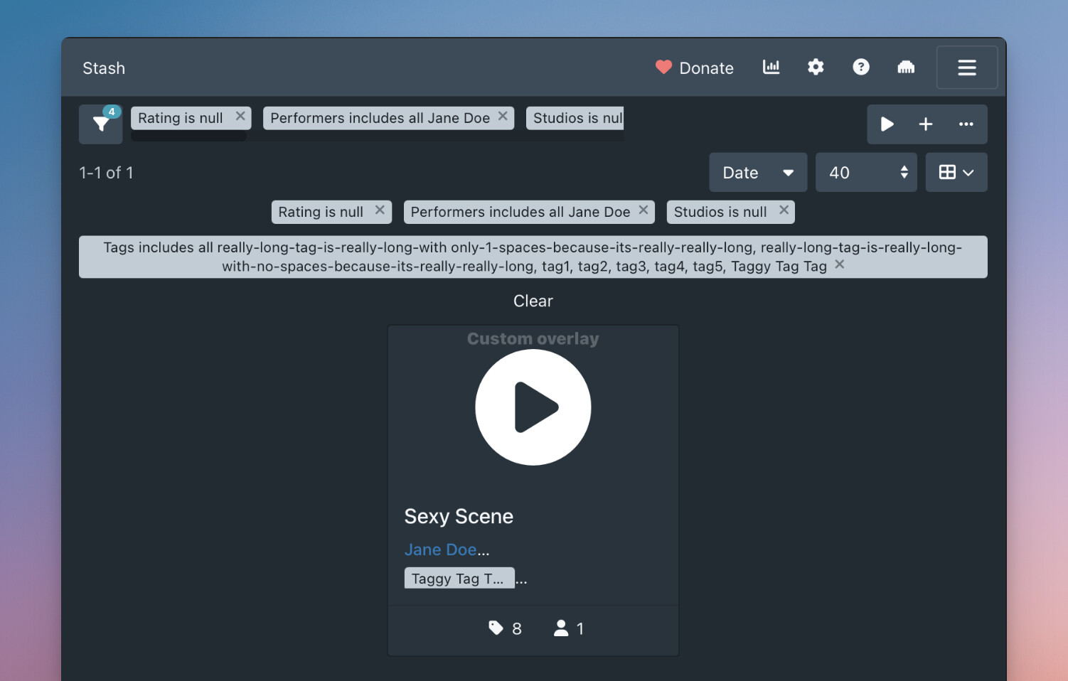
The issue that I’m having is that the filter tags are pushing out the right buttons, despite having the filter tags in a scrollable container with a max width set.
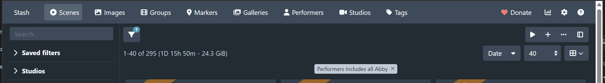
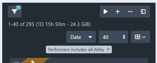
For the purposes of illustration, I’ve set the width of the left side container div to 60%. This is what it looks like when it’s functioning somewhat correctly:
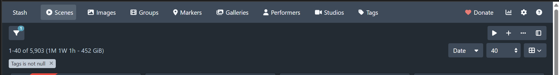
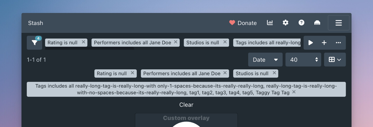
Now, if I add more filter criteria, the container div hasn’t grown, but the right buttons have been pushed out anyway:
In the dev tools, if I mouseover the filter list, you can see the filter tags that I think are pushing out the buttons:
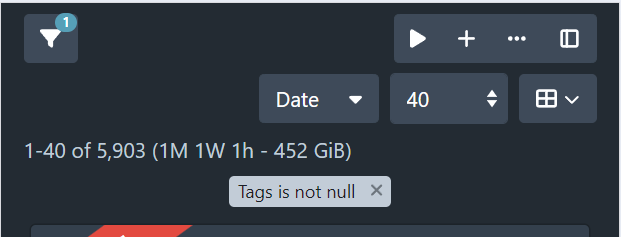
If I remove the extra filters and scroll to the right, you can see where the elements end:
I feel like I solved this the last time I looked at this stuff, but I don’t remember how. Any help would be appreciated.
1 Like
I’m still struggling to figure it out as well but it is connected also to the tag badges below, as deleting it allows the bar to shrink, I believe that it’s the lack of whitespace and wraparound
Instead of width: 60% set flex: 60% 0
My browser wasn’t hot reloading, so I was lulled into thinking I’d found the fix when I hadn’t.
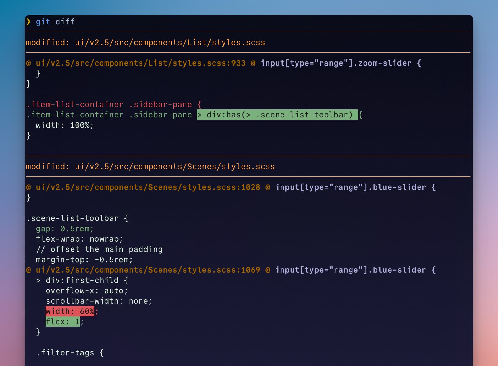
The actual fix is to set width: 100% on the immediate parent container of the toolbars (it currently has no class).
diff --git a/ui/v2.5/src/components/List/styles.scss b/ui/v2.5/src/components/List/styles.scss
index 4fd1230ff..e3c8924b4 100644
--- a/ui/v2.5/src/components/List/styles.scss
+++ b/ui/v2.5/src/components/List/styles.scss
@@ -930,7 +930,7 @@ input[type="range"].zoom-slider {
   }
 }

-.item-list-container .sidebar-pane {
+.item-list-container .sidebar-pane > div:has(> .scene-list-toolbar) {
   width: 100%;
 }
2 Likes
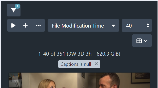
I removed the 60% width limit and added a bit of a gap between the end of the filter list and the right buttons so the fix is more obvious.
1 Like
Thanks @angrytoenail! I’ve adapted your solution into something general and I think it’s working. Much appreciated! 
1 Like
It’s looking great @WithoutPants!
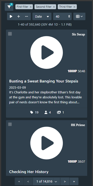
I’ve had a quick play around with using slick to carousel long filter lists. I’ve found it a bit of a dog to work with, and the implementation pushed to the above-mentioned branch does not work very well, but it’s enough to get an idea of how it might look.
Reiterating my earlier argument, I don’t think having to scroll/click multiple times to see the entire criteria list is great user experience.
Moving the overflow behind a mouseover control seems to me to be the better option. I’ve prototyped the mouseover behaviour, shown below:
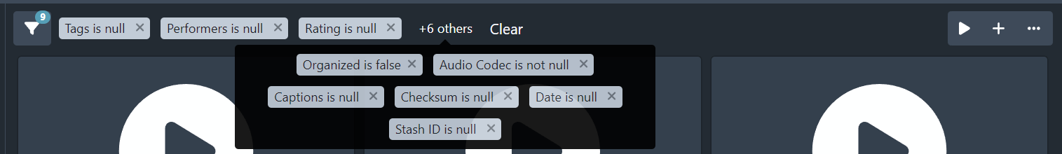
We can of course change the number of criteria shown. I’m not sure if we can easily do it dynamically (ie show the control only if it overflows). I also need to figure out what to show on smaller viewports like mobile.
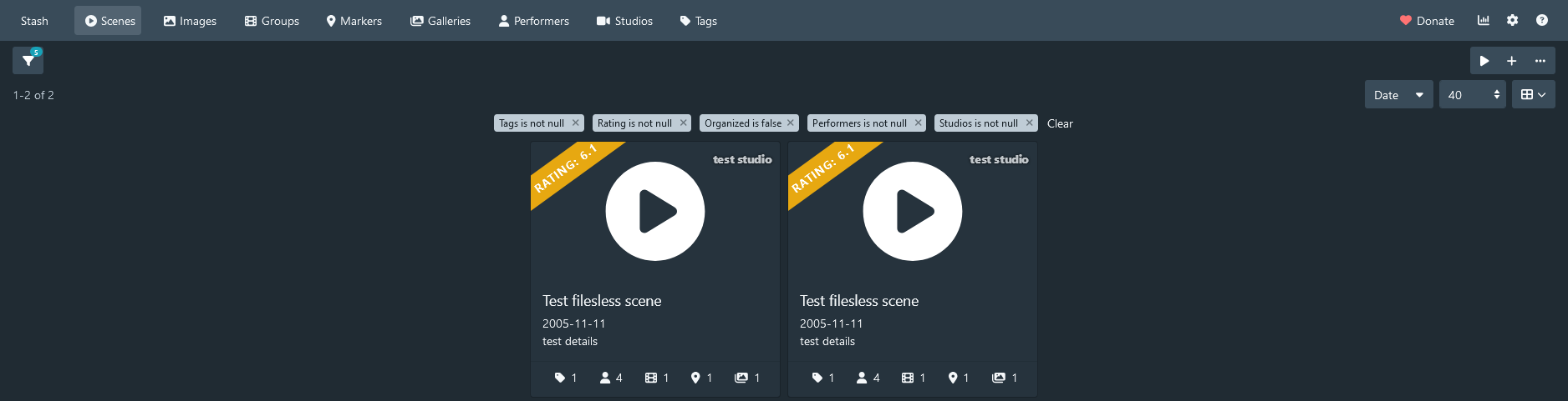
For those watching here and not on Github, I’ve raised a PR for the filter tags in toolbar feature. Show filter tags in scene list toolbar by WithoutPants · Pull Request #5969 · stashapp/stash · GitHub
It was a bit of a learning experience dealing with overflow detection and viewport intersection, but I’m pretty happy with how it turned out. Hope you guys like it.
1 Like