Back again to annoy not one but 2 people this time; there seem to be some conflicting code? Search button open the Image Deck Viewer @SakotoDeck Viewer - #27 by goodmann0632
Alrighty, here’s a feature for The Suggestion Box:
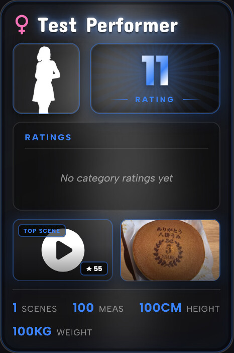
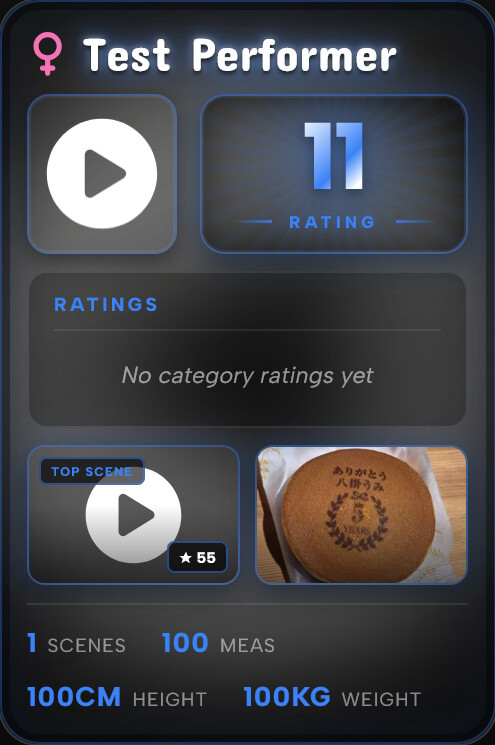
If you’re going to have a playing card option, what about having a Flip All/Single Card option/button with a neat animation. The main details on the front, and then perhaps user-defined tags or attributes on the back, along with a detailed photo(s).
The magnum opus of this though however, would be to incorporate your advanced rating plugin categories too.
And if the stars are aligned these cards are what are compared in the ascension plugin too.
(Playing card mode on lite mode is still very heavy on my laptop too)
The entire list was so much more manageable with the disabled plugins at the bottom that it’s really jarring to go back to them being intermixed.
Even a toggle to just hide disabled plugins would help, but what was there before was a better UX for trying to get settings right. I very rarely am AB testing plugins, but fairly frequently am adjusting settings for active plugins.
Another feature request/option that could help is keeping the filter search bar floating at the top and remembering your filter when you leave the page and return. Again for the fiddling with settings use-case.
A minor bug I’ve hit: In the Stash page, when you go to customize, if you + Add, the dialog options don’t theme correctly. They end up as white text on white background making them not readable until you highlight them. Once highlighted the text changes color to black and the background becomes powder blue so you can read it only when highlighted.
Absolutely fantastic plugin that also has a pretty slick theme on top, btw.
Just added V1 of this feature to refract, take a look and tell me what you think. Credits go to you for this one, your idea. Advanced Rating has been integrated, not Ascension yet, if you’ve got any ideas for that, do share!
And if the stars are aligned these cards are what are compared in the ascension plugin too.
Not got much inspiration today on how to go about this, so yeah share if you have an idea. thx again
@JoeBiden I have also tuned lite mode further, should be a little lighter now, but let me now how it feels. Since all I’ve got to test this currently is my maybe slightly overspecced PC, its a little hard to identify performance gaps.
I submitted a PR upstream, with the behaviour I originally implemented (disabled plugins sorted after the enabled) but the Stash team seemed to prefer the current behaviour, so I changed refract to follow. The current behaviour is what will be implemented next Stash update I expect. However, going to add the option to restore the old behaviour in the next Refract update.
Thanks for sharing your opinions! (I actually agree with you both on this one)
@ordureconnoisseur Thanks so much for adding the Lite mode switch to the Refract Cards plugin! It works great and makes a significant difference for my setup. I really appreciate your quick response and outstanding work on this.
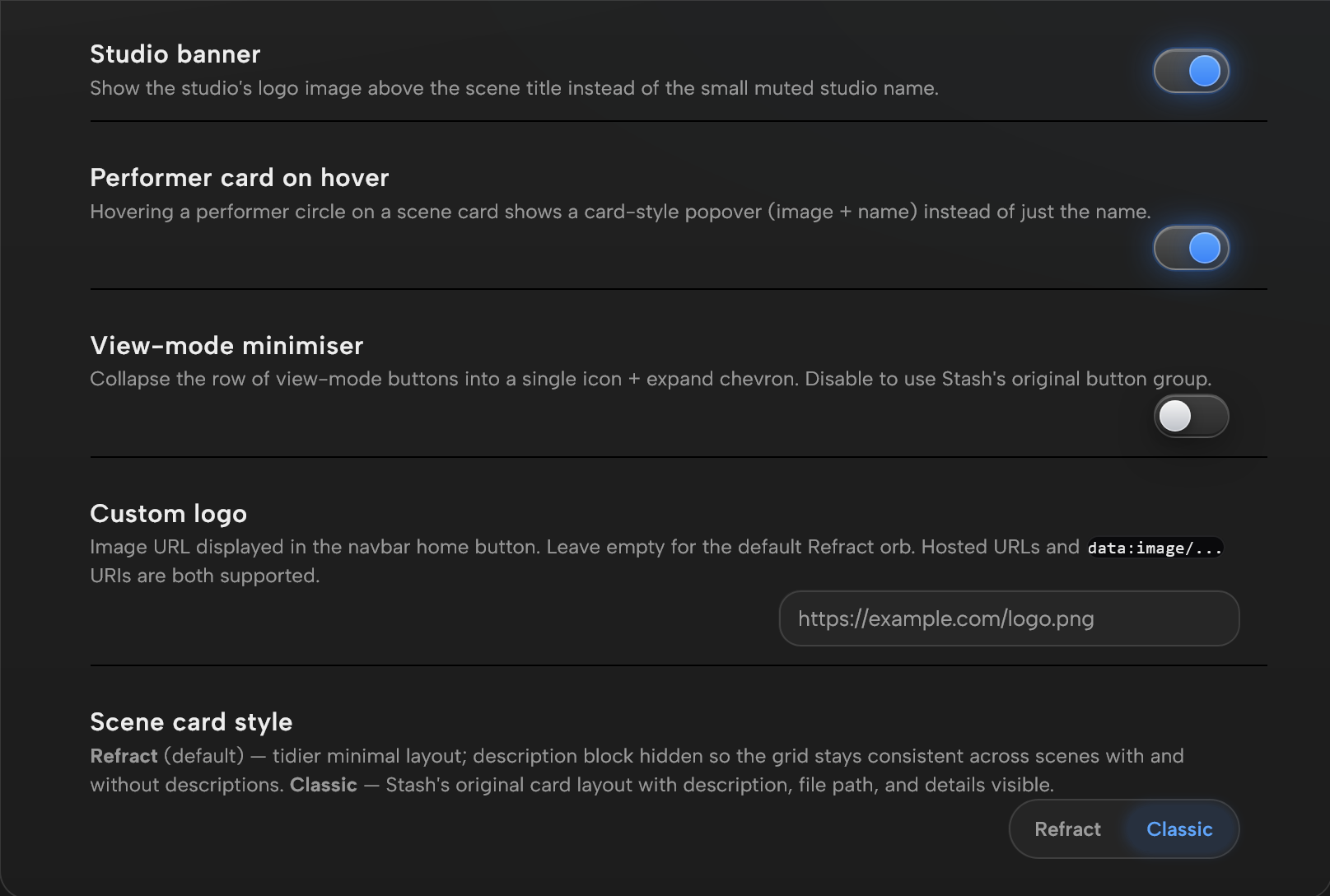
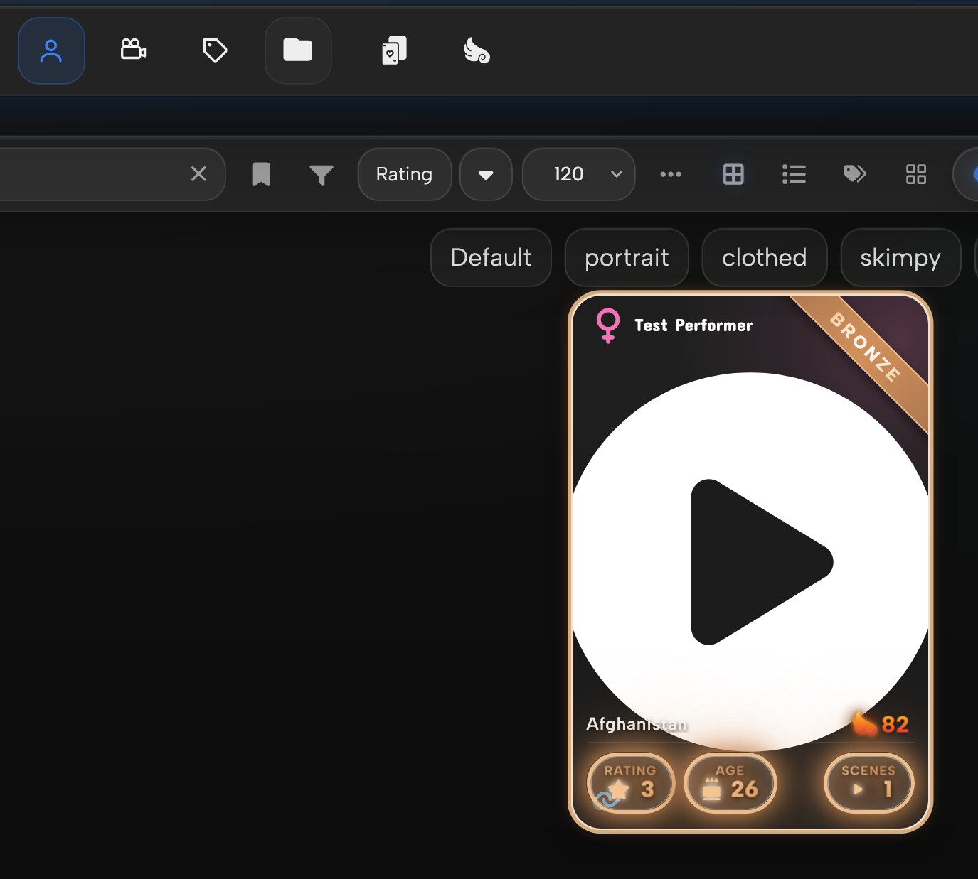
Would it be possible to change how studios appear on scene cards? Since playing cards put the rarity banner in the top right corner (covering studio) and the studio background tint doesn’t really match refract styling, would it be possible to make the studio name (or thumbnail I suppose) appear on hover in the top middle? It could realistically appear anywhere on hover but there seemed to be available real estate in top middle. I originally thought it might be better added to the bottom left stats but couldn’t come up with an aesthetic solution accomplishing that.
@detox22 the banner over the studio is intentional, but I’m experimenting with your idea (drop the logo, show the studio name beside the title in the accent colour). Not shipped yet, but it’s on the list. Thanks both. Also managed to fix the logo background, was a lite-mode quirk!
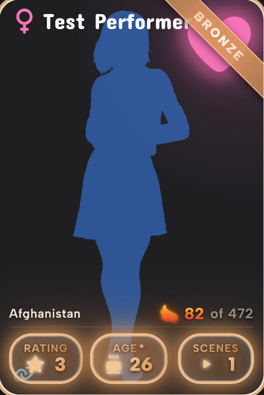
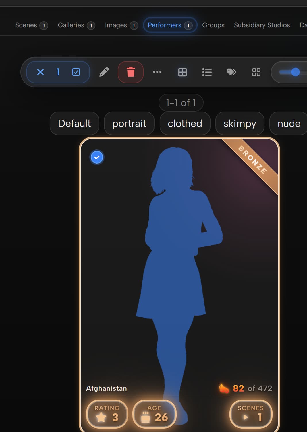
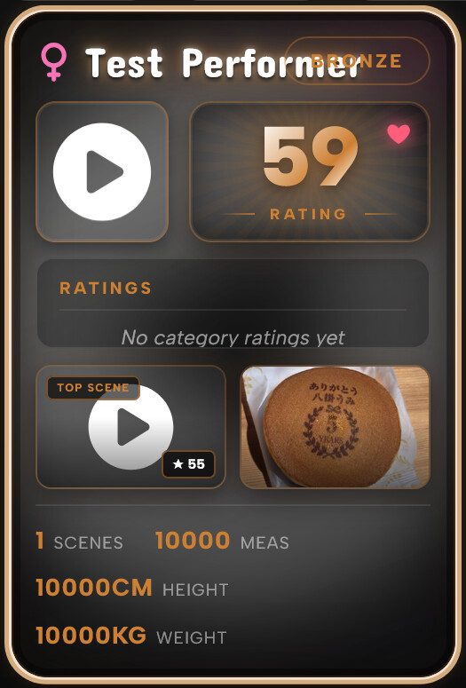
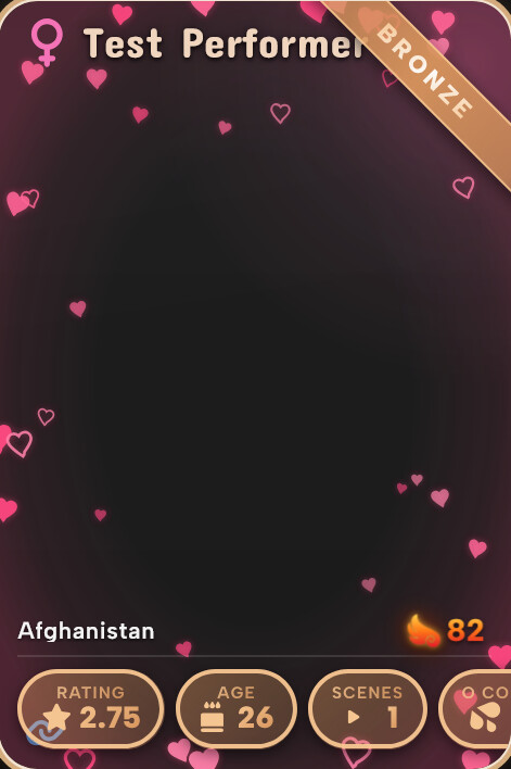
Bronze ‘summary’ # for performer seem to be cut off; also should these be more consistence with size instead of smaller and bigger depending on how many type of field they have?
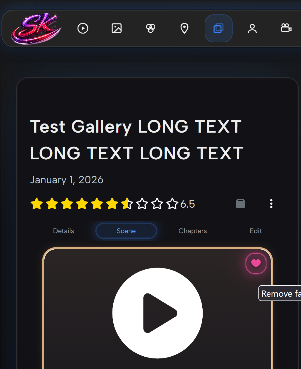
lol, I thought I could break you but it seem that you thought of it; decide to give them 10,000. But I did see new bug, the “Organized” part is unreadable.
Thanks for the really thorough testing. Just pushed an update covering a bunch of this:
Name now has a shadow so it stays readable on light backgrounds.
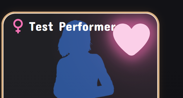
Good catch on not being able to tell what’s favourited: in lite mode the favourite animation is off for performance and nothing was replacing it, so there was no indicator. Lite mode now shows a static heart halo around the card to mark favourites.
The Ascension “of N” was coming from that plugin’s own markup, I now hide it so it reads as just the rank. While on that, I noticed Ascension doesn’t inject its badge in the scene details panel at all, so there’s no rank shown there.
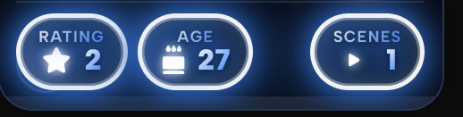
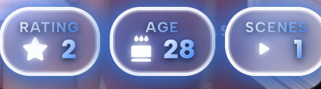
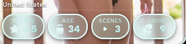
Stat pills always show the same four now and fit consistently instead of resizing/cutting off.
Favourite heart is now a consistent size across the panels.
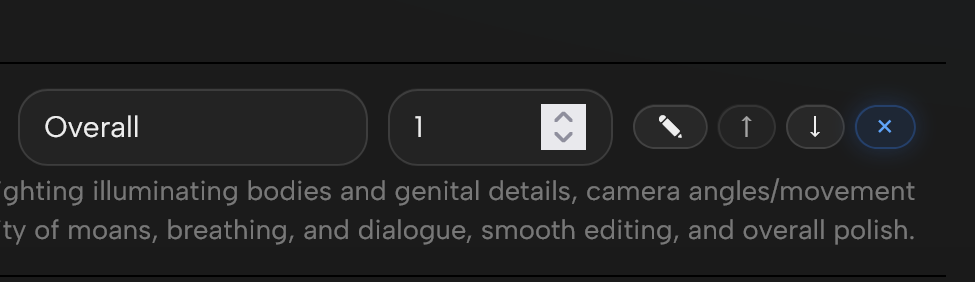
Still on my list: the “Organized” text being unreadable with extreme values, and the number stepper arrows, which from my experience aren’t very easily stylable but I’ll look into tomorrow.
Appreciate you trying to break it with the 10,000s, ha.
Assuming that is with Lite mode on, yeah its a work in progress at the moment. Blurs and stacked shadows (what I would use to help the text stand out more) are very expensive and tank performance - hence why its currently limited to just the full mode at the moment.
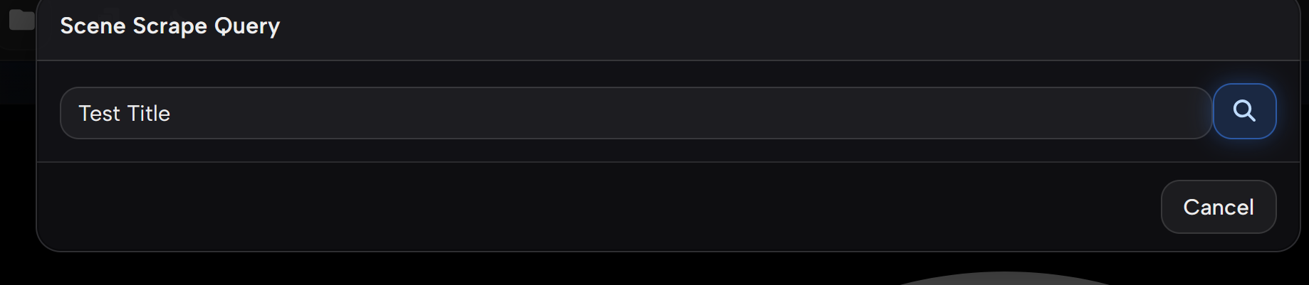
 will open
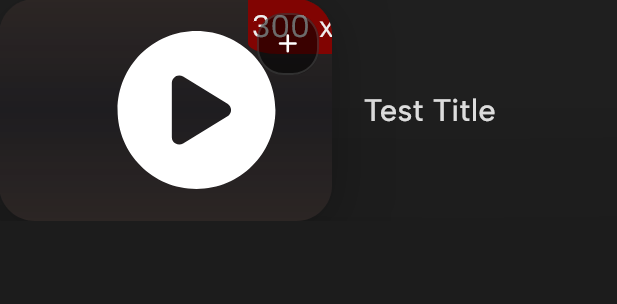

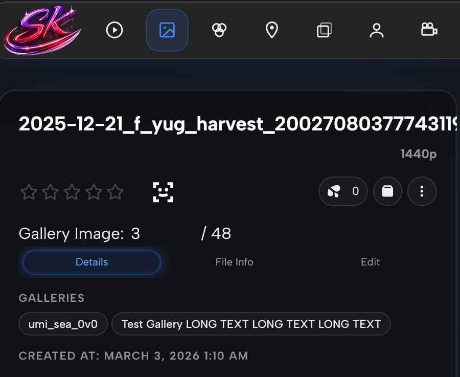




 I’m just checking in every now and then because it’s very nice theme if all the linor things gets ironed out! Keep it up