Sharing a theme I’ve been polishing for a while. Refract is a liquid-glass re-skin of every Stash surface — frosted glass panels, dark base, configurable accent, plus a rating-driven card system that turns high scores into glowing collectibles.
8 accent presets (plus custom CSS override) — pick one, applies live to every surface.
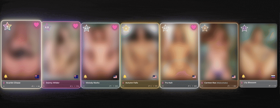
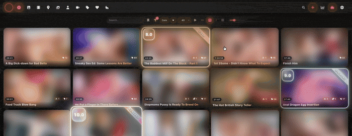
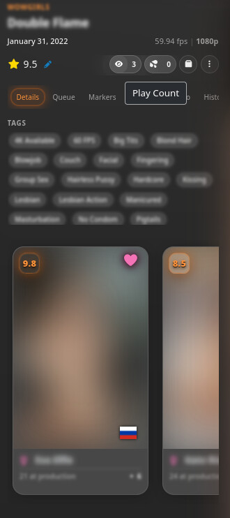
Three rating-display styles for scene and performer cards — Minimal (accent halo), Extravagant (six-tier collectible-card frame from Bronze to Perfect with escalating animations), Playing card (trading-card layout for performer cards).
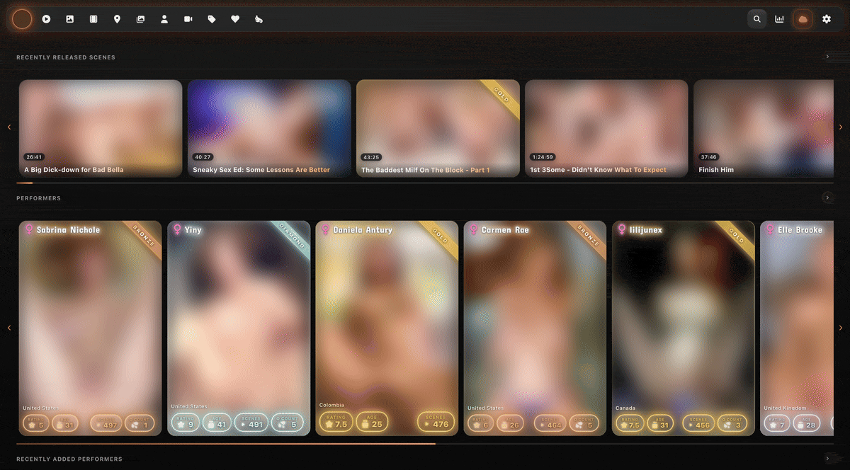
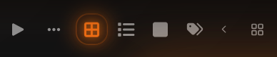
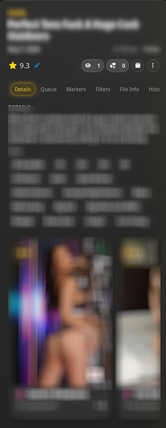
Refract scene cards — title overlay on thumbnail, glass spec pills, performer / tag / O-count pills with hover popovers, watched-progress + hover-scrubber layered as one bar.
Scene player upgrades — controls fade after inactivity (windowed + fullscreen), restored sprite-thumbnail scrubber preview, seekbar flicker fix.
Tag editor + duplicate checker overhauls — alphabetical tag taxonomy with image + description hover popovers; comparison-card redesign with highest-res / largest-file callouts.
Lite mode — strips blur, shadows, and animations for older or integrated GPUs.
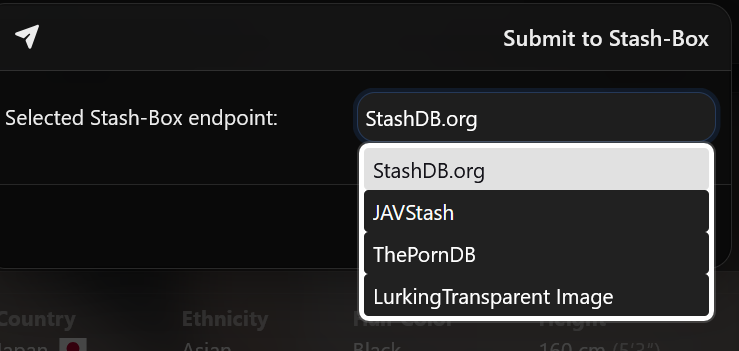
stash-multiview integration — accent picked in Refract flows through to the multiview player via localStorage; glass styling throughout.
See it in action
Rated cards earn tier-coloured frames, glows, and animations that escalate with the score. Bronze breathes quietly; Perfect rotates a rainbow halo with a floating ribbon.
Both scene and performer cards are tiered. Long grids with many high-tier cards can be GPU-heavy — flip Lite mode on if you notice scroll jank.
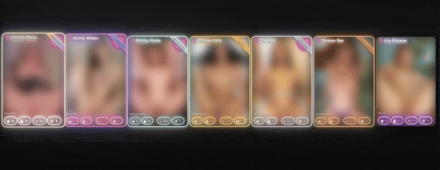
Playing card — performer cards as trading cards
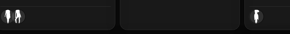
Top: name banner with tier-coloured glow (a gender icon sits to the left like a type symbol). Bottom: a neon stat strip overlaying the image — rating, age, scene count, O count, country flag. Scene cards keep their normal Refract chin in this mode.
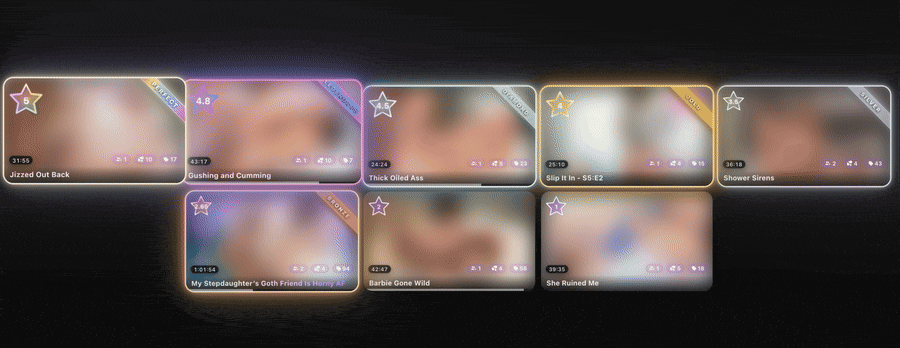
Refract scene-card layout
Title overlays the thumbnail, metadata reduces to a row of glass pills, the image stays the dominant element. Hover the performer / tag / O-count pills for popovers; the watched-progress and hover-scrubber stack into a single two-colour layered bar at the bottom. (Stash’s classic row layout is still available via a toggle.)
Install
Settings → Plugins → Available Plugins → Add Source
Refresh the available plugins list, find Refract Theme, hit Install.
Reload Stash. The plugin self-enables.
Updates flow through the plugin browser thereafter.
Compatibility
Stash: tested on 0.27.x. Older versions may work but aren’t tested.
Browsers: Chrome ≥ 105, Edge ≥ 105, Safari ≥ 15.4, Firefox ≥ 121. Refract uses :has() extensively for context-aware styling, which gates the minimum.
Rating system: Refract auto-detects whether Stash is configured for STARS or DECIMAL and adjusts the rating banner shape (5-point star vs squircle pill) accordingly. No setting needed.
Known limitations
Older Stash / older browsers: anything without :has() support gets only partial styling.
backdrop-filter cost: heavy frosted-glass usage may hitch on integrated GPUs — Lite mode is the off-switch.
Extravagant on long grids: tier animations multiply with card count; Lite mode strips the animations while keeping the tier colours.
Third-party plugin UIs: plugins that inject their own modals/panels and don’t reuse Stash’s standard Bootstrap classes won’t be themed until Refract gets a rule for them. File a GitHub issue with the plugin name if you want one added.
Feedback
Issues, requests, screenshots of weird-looking surfaces — all welcome. Happy to take colour-preset suggestions too if there’s a shade missing from the eight defaults.
AI disclosure
This post and the project’s README were assembled and heavily polished with AI. AI is a core part of my workflow: auditing, debugging, and occasional refactoring all run through it.
After a bit more time with it, I’m running into the Markers tab on scenes getting an error of “NotFoundError: Node.insertBefore: Child to insert before is not a child of this node” after creating or updating Markers. Tried disabling other plugins but still am running into it.
Screenshot look neat, I still don’t know about the Glass style though. Will give it a try. Thank you.
EDIT:
Love:
Performer Image icon in grid view.
Interesting, you also changed the Player as well, but moving the Loop to the left it kinda weird imo.
Hate (Complaint):
Having to click this as it default ‘minimized’
Hmm not sure how I feel about the always on top bar, I thought it would be the search bar that should be on top, so we can filter quickly. Also lost my SK logo
lol, all Portrait style photo will now be headless;
Thanks for the detailed write-up, genuinely useful. Hard to catch all of this without other people’s setups in the mix, so I appreciate you running through it.
Going to work through these fixes today. One quick question, what are you referring to with the SK logo? Want to make sure I’m patching the right thing.
Cheers for the detailed writeup, most of what you flagged is fixed in v1.5.1.
Patched:
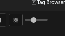
Tag browser zoom slider: restored. I’d hidden it for my own use; fair point that others want it.
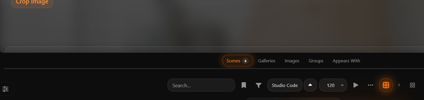
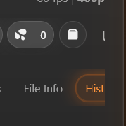
Right-side scene tabs (File Info / Hist) not reachable with a vertical-only mouse: They were always there, but you’d need a side-scroll wheel to reach them. Mouse-wheel over the tab strip now scrolls it horizontally too. Active-tab accent glow that was getting clipped is also fixed.
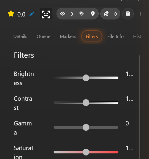
Filter panel labels - all fixed.
Sharp seam under the performer hero - added a soft fade mask on the image bottom plus extra spacing before the section nav.
Loop button moved to the left in the player - unintended side-effect of how Refract reorders the video.js control bar. Any control without an explicit position was getting pushed leftmost. It now defaults to the right end like you’d expect. Quick question though, is the Loop button from a plugin? I don’t have it in my own player, so I’m guessing it’s added by something you’ve installed.
Could use more context:
Headless portraits - Stash sets object-position: center top on performer card images by default, which is what prevents headless crops in the first place, and Refract doesn’t override it. Could you check your Stash version and any Custom CSS you might have applied? A specific performer card where this shows up would help me dig in.
SK logo - what’s this referring to? Couldn’t place it. Custom branding from another plugin?
Now configurable in plugin settings:
View-mode minimiser toggle, if you’d rather keep Stash’s original button group instead of the dropdown, flip it off.
Custom logo URL - paste any image URL (or a data:image/... URI) to replace the orb in the navbar. Tinted to the same soft white as the surrounding navbar icons.
Left alone (subjective):
Rating design, happy to revisit if you have any suggestions.
Thanks for the time and especially the screenshots, most useful kind of feedback to get.
Looks nice! But theres a lot of weird stuff going on
Stuff doesnt quite fit in the info panel, and the buttons are a bit weird (see image) also the operations button (tthree dots) doesnt open for me, looks to be hidden.
Most of that’s fixed in v1.5.2, apologies, I’m a trackpad user so I never noticed how unintuitive horizontal scroll is on a mouse. The performer card carousel now has left/right buttons; everywhere else, vertical wheel-scroll over a strip moves it horizontally. Operations button should also work now - broke it with the last fix I made.
Update via the plugin browser to grab it. Let me know if anything still looks off.
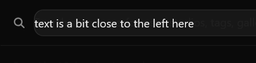
Hey Mr, would it be possible to at set the border on the side panel to fit 2 performers? aswell as the entire navbar so you dont need to horizontally scroll, think that would clean up the look. and make it usable for me personally.
Side panel now fits 2 performer cards. The performer section is count-adaptive: 1 = hero, 2 = side-by-side, 3 = 2 + 1 centered, 4 = 2×2 grid, 5+ = single-card carousel with pagination dots and keyboard arrow nav.
Tab navbar fits all 7 tabs without horizontal scroll, tabs stretch proportionally to fill the panel width.
One bit I left scrollable on purpose: the scene toolbar row (rating, counts, organize, menu, plugin buttons). Plugins inject their own buttons there, so the count varies per user, pinning it to a fixed width would break for anyone running a few scene-page plugins.