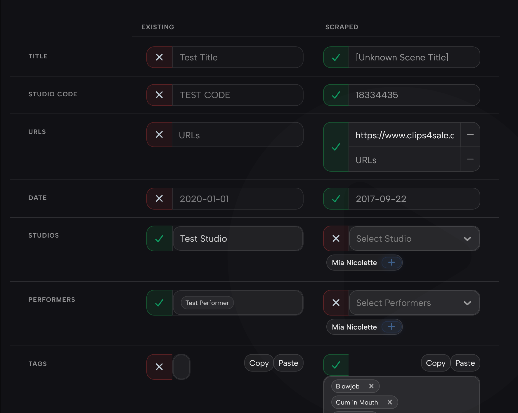
Not sure if you have to reduce the ‘left’/1st column to be slightly skinnier so there is more room for actual data text (Current/Existing meta)
for me the settings work differently than other Plugins, it seems like they are stored locally not in Stash - as every new browser I install I need to change Refract accent color setting
1 Like
Just published an update with server-side settings persistence. Should sync to all of your stash instances on all devices/browsers now.
1 Like
awesome just tried that server side settings and working perfect. Thanks heaps for this theme, its really amazing
1 Like
Thanks for the detailed reports and screenshots, this is really useful. Here’s where things land for the next update:
Fixed
- Tag Sidebar plugin styling (@sashi): the theme now skins the Tag Sidebar plugin to match. It floats and rounds like the rest of the UI, the tag tree no longer pushes its rows out of the panel when you expand a parent, the count numbers stay clear of the scrollbar, and the toggle is a slim vertical tab that slides in sync with the panel.
- Hover popups too transparent / text hard to read (@sashi): the hover card and performer popups are now solid rather than see-through, so the title and performer name read cleanly. Gallery popups got the same treatment so the two are consistent.
- Accent colour resetting on relaunch (@detox22): settings now save to your Stash config instead of per-browser storage, so the accent and the other toggles persist across reloads and relaunches.
- Tag popups cut off at the top of scene cards (@detox22): the tag list now renders above the card instead of being clipped by it, and scrolls if the list is long.
- Organized badge (@detox22): the organized button in scene details now lights up in your accent colour with a soft glow when a scene is organized.
Works already
- Studio banner (@detox22): there’s a toggle for it in the Suggestion Box settings, and it’s showing for me and others (thanks @sashi for confirming). If it’s still blank with the toggle on, it’s almost certainly a stored-settings issue. Toggle it off and on once after updating and it should appear.
Planned
- Studio name styling (@detox22): agreed the rectangular tint doesn’t scale well across logo sizes and the names don’t match the rest of the design language. I like the stylized-bubble idea (like the ratings), I’ll rework it that way.
Leaving as-is for now
- Plugin Enable/Disable grouping (@sashi): fair point that disabled plugins “disappearing” can be confusing. I’m keeping the current sort for now, but I’ve noted it.
Update should be live shortly. Keep it coming.
1 Like
Is it possible to support both desktop and mobile mode? Or it would require a different theme. Here is an emulated phone screensize on desktop using developer (F12) mode.
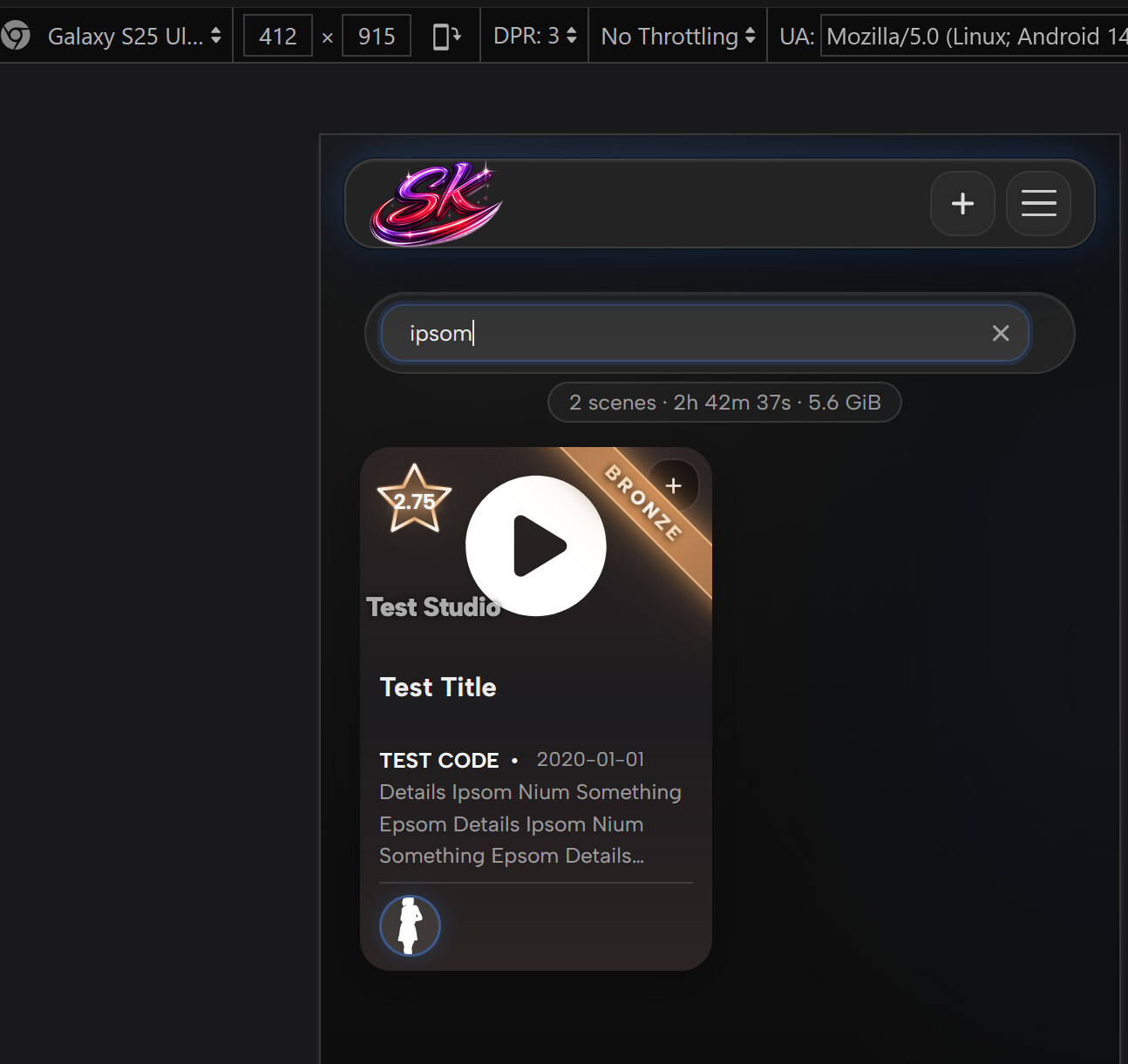
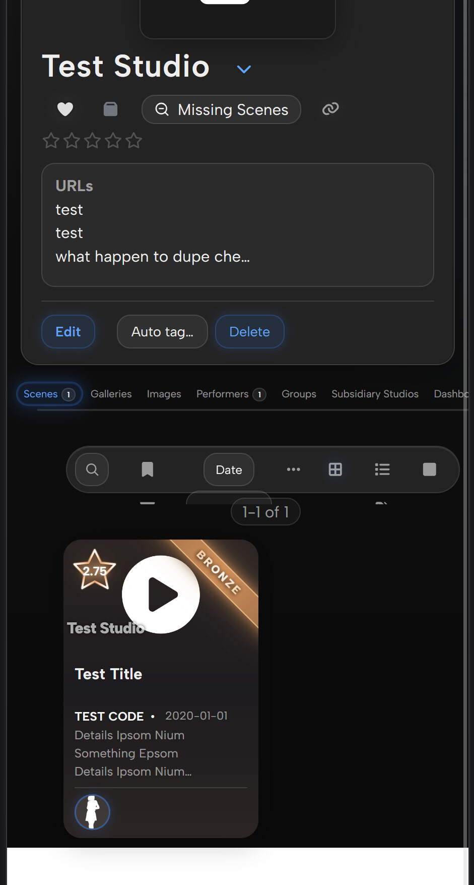
It pretty good at the moment, but if you don’t enable Phone Screen mode and just use a very portrait view on desktop it will be all messed up.
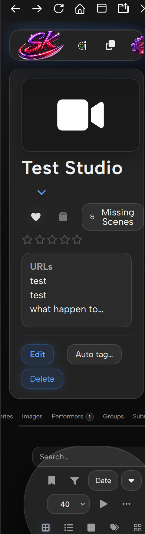
Do I complain to Sakato? Or to you 
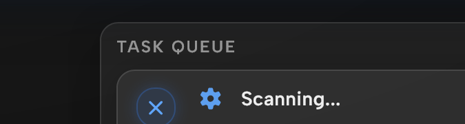
Task scan constantly jump up and down if you Maximize (down drop arrow)
Ascension 1.2.5 hides and replaces the default rating badges. If this plugin uses that, then there could be conflicts. Try an earlier ascension version and see if it persists
It only on the latest version of yours (release yesterday) that have this issue. Previously Asc did not
Try disabling the rank badge in plugin settings. Let me know what happens.
Edit:
Fixed in Release Ascension 1.2.5HF1 · Servbot91/Sakotos-Stash-Repo · GitHub
1 Like
Quick update in terms of issues with mobile. Main navbar doesn’t work properly on mobile. Options that are disabled in interface still appear in navbar, nav buttons that are added by plugins do not appear. On another note, could you please rework how markers appear in scene details? currently not very useful. I like having the categories that show all similar markers in a scene, but can you make them look a bit cleaner and take up a bit less space? Also, for the individual marker view (under the categories), I care more about it being in timeline order than alphabetical. Is there any way you could add a feature where hovering over where a marker appears on video progress bar shows a little pop up with the name of the marker?
1 Like
That fixed it. Thank you… filler 20 characters for discourse
1 Like
I really like the card rating tier system and playing card overlays in your Refract theme, but I prefer to keep the default stash theme for the rest of the interface.
I tried copying the card-related CSS from the repository, but I couldn’t get it to work on its own.
Would you consider releasing a separate CSS snippet or plugin just for the card styles? Alternatively, could you point me toward the specific files or rules needed to extract them manually?
Thanks for your time and work!
Hey @Kraven99, shipped this as a separate plugin so you can keep the default theme everywhere else.
It’s called Refract Cards: the rating tier system, the playing-card performer layout, and the glass/glow/tilt card look, on top of the default Stash theme.
It’s added to my plugins repo, so it should show up as “Refract Cards” in the same place you installed Refract.
Happy to tweak it too. I can match the card corner radii to native Stash if that’s more the look you’re after.
1 Like
Markers @detox22
- Reworked the scene-details Markers tab: cleaner, denser Categories cards and markers
- Hovering a marker on the progress bar shows its name again, I’d been hiding that tooltip; it’s back and styled.
- Within-category order is already timeline-based in current Stash (handled server-side). was not able to replicate on my end.
Mobile navbar @detox22
- Disabled interface items no longer show in the mobile drawer.
- Plugin buttons that use the standard link+icon pattern now appear too. A few plugins inject differently and need per-plugin handling, so if one’s still missing, tell me which.
Task queue @sashi
- The scan row no longer jumps up and down when expanded, it holds a fixed height now.
Desktop + mobile @sashi
- It already does both: touch devices get the mobile layout automatically, desktop stays desktop. Your broken portrait shot is a desktop window dragged narrow but still on a mouse, the mobile layout keys off a touch pointer (not width), so a real phone gets it right.
Ascension badge @Sakoto @sashi
- Glad HF1 sorted the conflict. Refract now styles the Ascension rank badge to sit neatly on the cards too.
1 Like
Boss, I don’t see it. Can you check?
Look good!
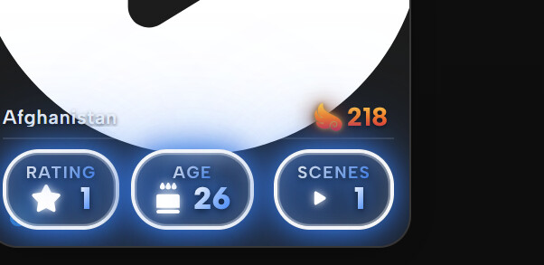
I see. Would it be possible to go into Mobile mode once the width reach certain “portrait” size? I sometime use Split view to do research (StashDB). It work quite good at the moment.
I believe this was fixed previous?
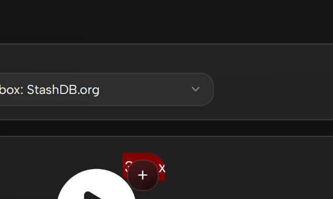
Resolution size on tagger view is still hidden;
1 Like
Thank you for pointing this out. I really like how the cards look, and I apologize for missing that you had already released Refract Cards as a separate plugin.
The only tweak I would suggest is adding a lite mode toggle to the card plugin as well, if that is feasible.
Thanks again for your time and help with this!
1 Like
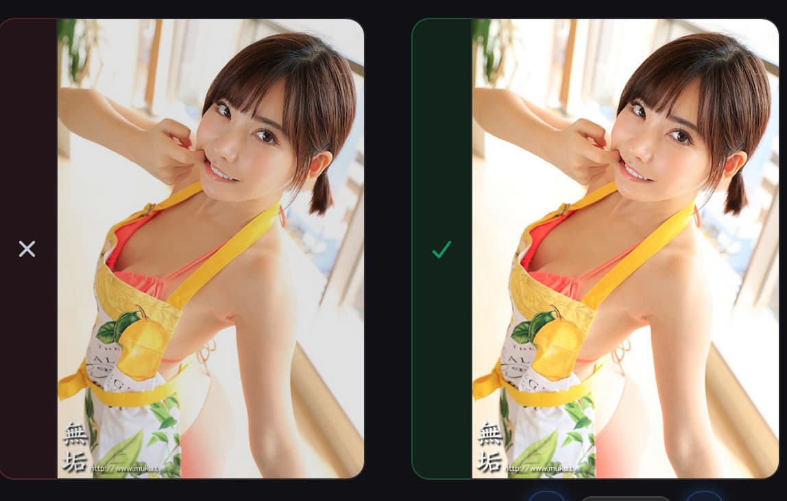
Is it me or the left image seem to be darker, opening the image reveal that the brightness is the same. This is kinda misleading me thinking one image is higher quality. Should a ‘shadow shady’ should be apply to image? This is for a Performer Scraping.
@sashi @Kraven99 thanks both, all live in the latest update
- Help button (@sashi): it’s under Settings → Interface → Menu Items. If it’s missing, update Refract, reload the plugin and hard-refresh.
- Mobile on narrow widths (@sashi): now width-driven, so anything ≤900px gets it, including iPad Split View and split desktop windows.
- Resolution/size on the tagger (@sashi): fixed, the overlay was being hidden in minimal-cards mode.
- Darker scrape image (@sashi): good catch. It wasn’t actually darker, the existing side was faded to mark it as current, which read as lower quality. Removed, both sides full brightness now.
- Lite toggle on the cards plugin (@Kraven99): good call, just added it, it’s the “Lite mode” switch in the Refract Cards plugin settings.
1 Like
Thank you! Markers works much better. Is there a way to add a button to the top right of markers in scene details (same design as “Create Marker” but on the right) which says “See All”. Clicking on the button opens a marker page filtered for all markers in that scene. There is no good way to do bulk editing of markers in scene details, that shortcut would help.
1 Like