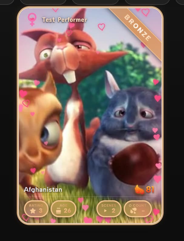
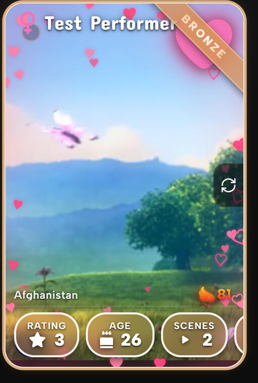
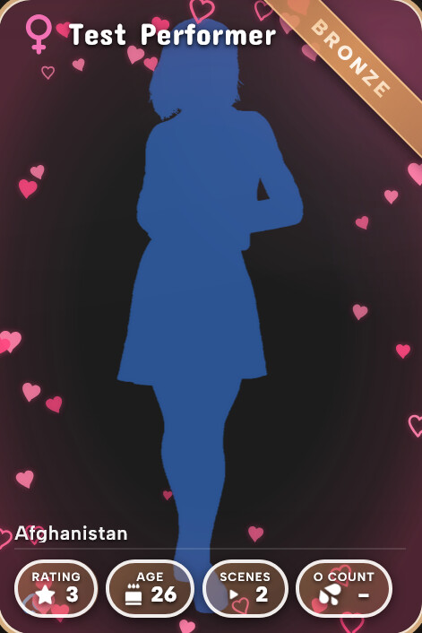
@Dining9093 Just pushed an update that fixes the gold-on-gold readability in lite mode (badges are now white text/border/icons with a small shadow). @sashi Also a fix so pills shrink to fit instead of clipping the last one. The hover-resize I couldn’t reproduce, so if it’s still happening let me know your browser zoom and window size.
Honestly though: despite a lot of work, this is still hard to render, especially full mode on weaker hardware. That’s a ceiling of being a CSS theme on top of Stash’s DOM. So I’m looking at rebuilding parts of it as a proper custom frontend (rendering the visuals myself instead of styling Stash), which should let the fancy look run fast even on weak GPUs. Going to prototype the performer grid first and see how it lands.
Could you also take a look at tag card styling when you have a chance? It looks a bit strange to have the separation bar and scene count, marker count, etc move based on description length. Perhaps locking them to the bottom of the card would help? Studio cards, same question. Also, tag cards do not appear to be affected by the size slider. Just wondering if theres a way to make the appearance a bit more uniform
Ah I thought it would be a plugins that causing an issue, please ignore me if you don’t plan to or want to support it. Stash don’t have any 'hover preview support’, it was done through a plugins;
Is it intentional that these coloring is removed? Personally I rarely touch it, but the effort whoever put in coloring these seem to be wasted if kept hidden
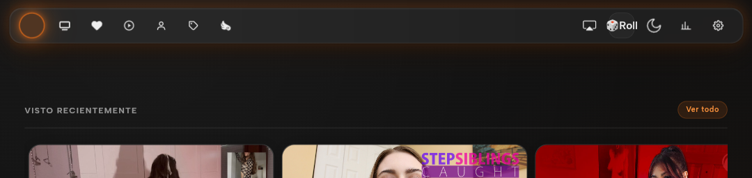
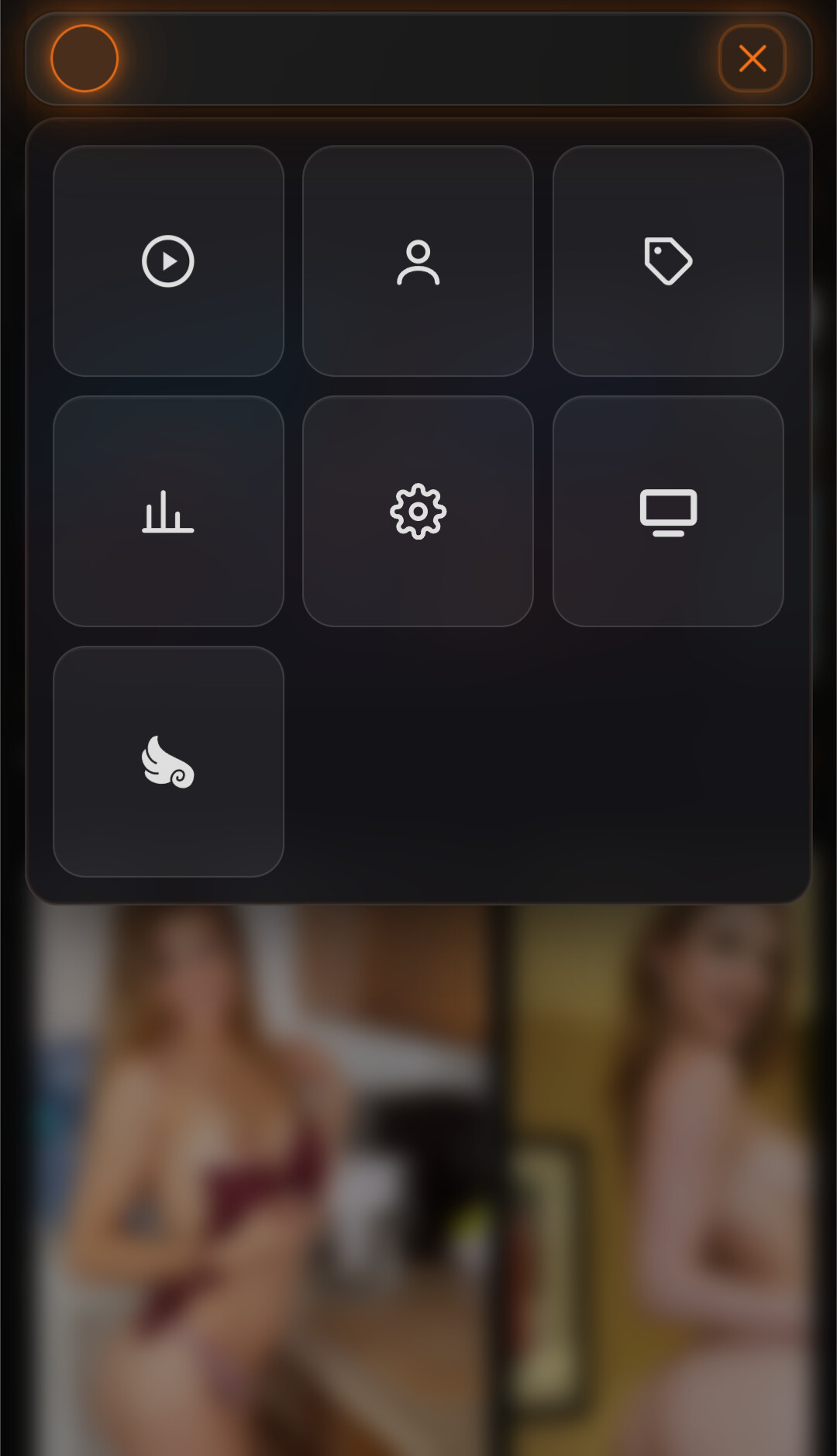
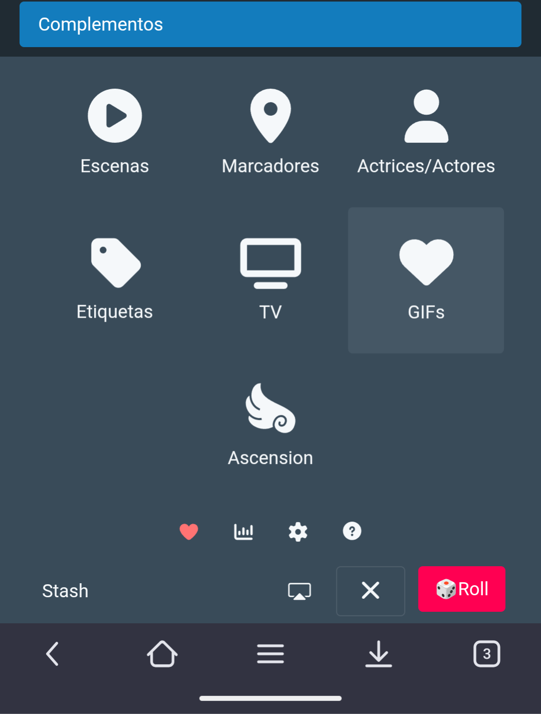
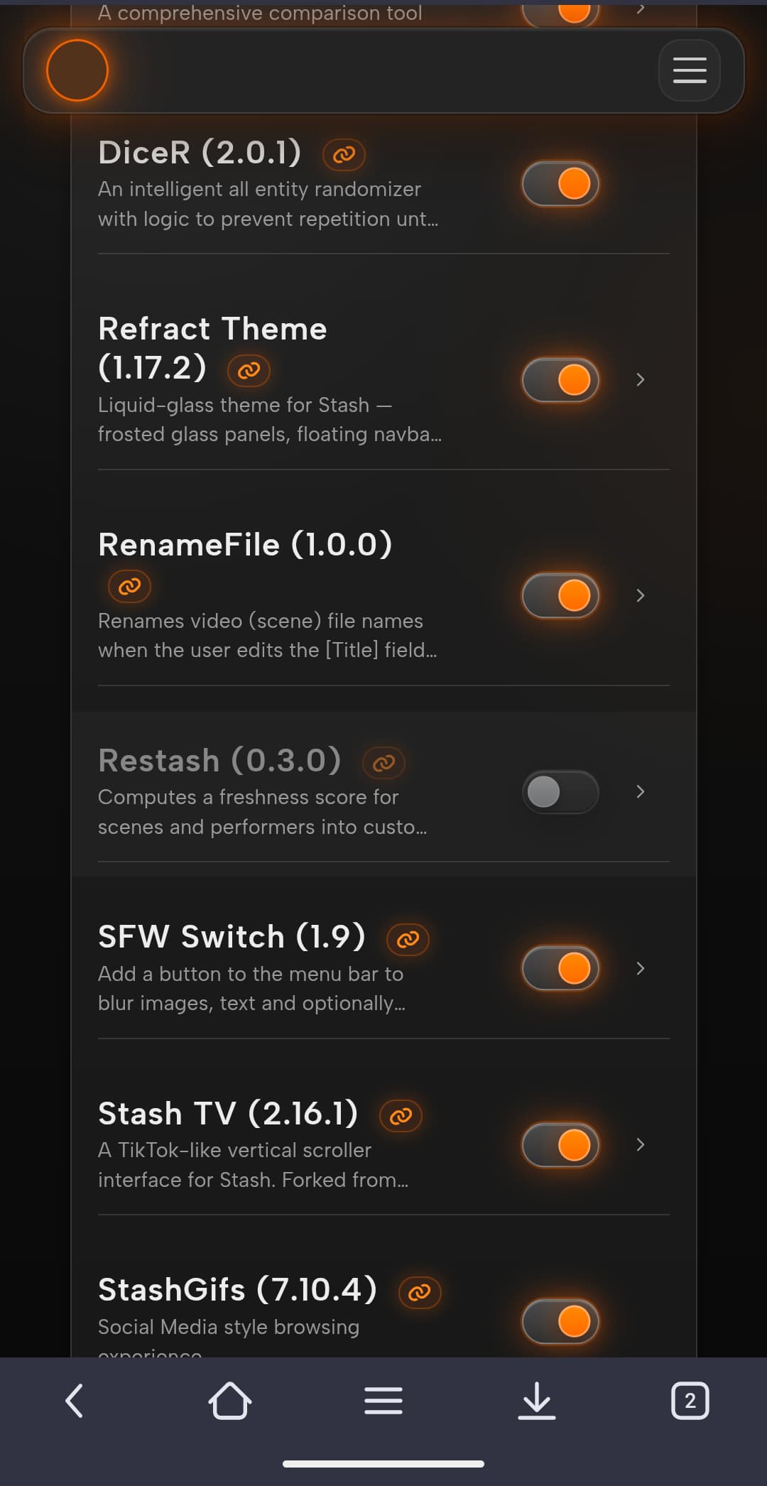
Thanks, glad you like the theme! Which plugin adds the navbar button that’s not showing up on mobile? Depends on the plugin, need to know which one to fix it.
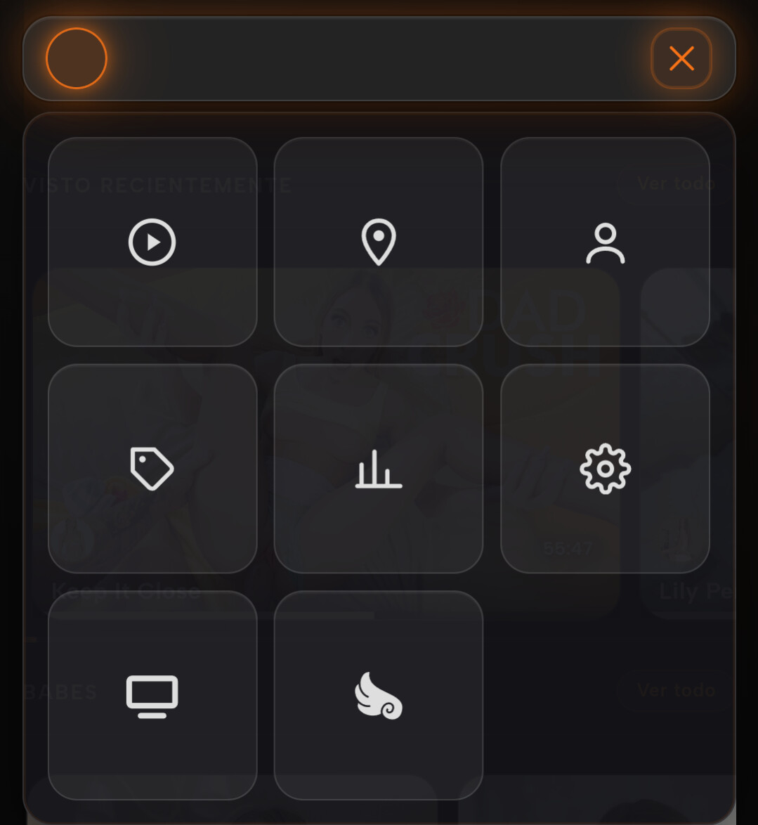
The first three (SFWSwitch, stashgifs, DiceR) are fixed in the version I just pushed, 1.17.3. Those plugins build their navbar buttons in non-standard ways, so Refract’s icon-only navbar and mobile menu weren’t picking them up. They now show proper icons in both the desktop navbar and the mobile menu, and the Random (DiceR) and SFW toggle work from the mobile menu too. Grab the update and let me know if any are still missing on your end.
On the other two: Stash TV works fine for me, both the icon and the interface, so if it’s misbehaving for you could you say what actually happens when you open it? Ascension is more involved since it swaps out parts of the performer cards, and I’m still smoothing out the rough edges there.
I updated to the latest version, but the problem persists; the icons still don’t appear. In the case of the Stash TV plugin, when you press the icon, a black screen appears; you just need to reload the page and the plugin starts working. However, in the default theme, the plugin opens a new browser window. The latest version I see is 1.17.2
Yes, version 1.17.3, which you mentioned, has already been released. The only plugin that’s missing is Ascension. All the others are working correctly. Thanks for fixing it.
Hello, I really like this theme, but I would like to mention an issue.
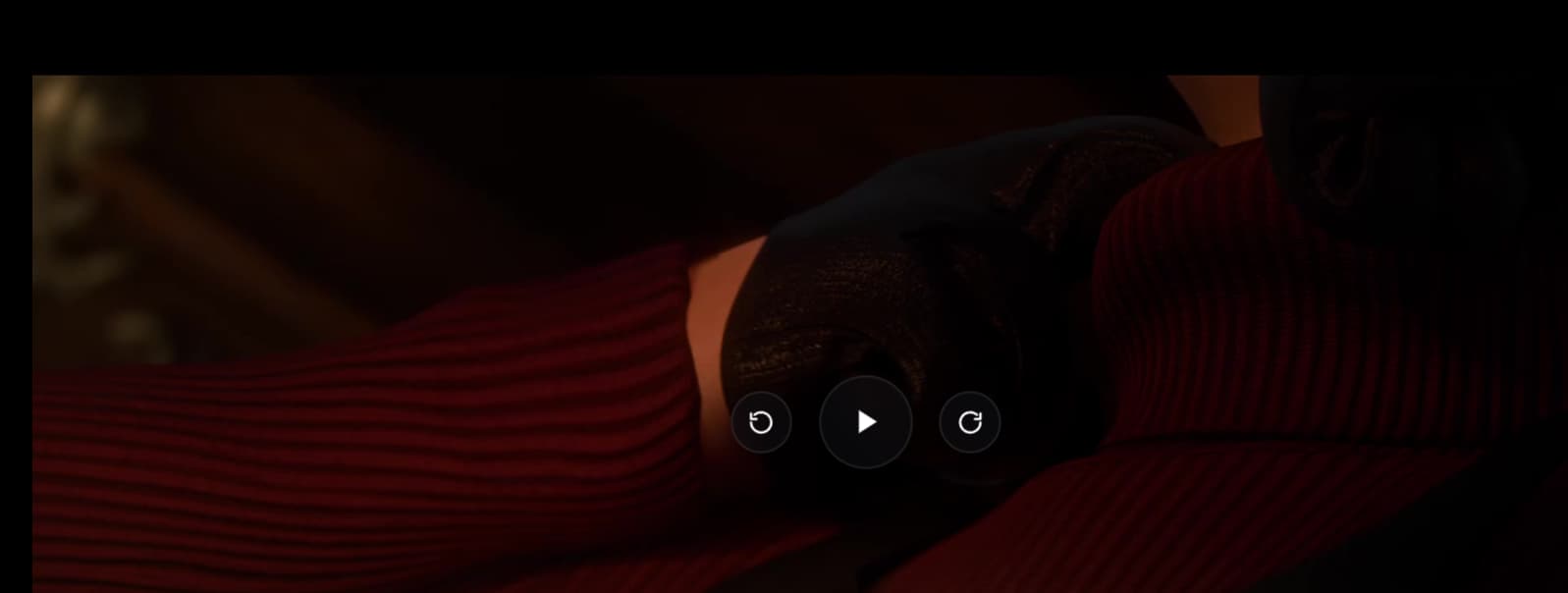
Many of the videos I store are around 30 seconds to 1 minute long, but the floating button takes too long to disappear, and it occupies a significant amount of screen space. It also appears whenever I pause the video or drag the progress bar.
I feel that most users probably operate using the keyboard, but this button does not seem to fit well with keyboard-based usage habits. Also, the default theme does not include this button.
What do you think? I just wanted to ask whether you have considered removing this button.
One icon that I noticed doesn’t show up still (and is probably custom in a new way) is the notifications plugin:
Feature request/suggestion: Is it possible to disable whatever mechanism moves everything to the overflow menu? On mobile, I have two taps per desktop-click, which is not an ideal exchange rate.
Refract’s icon-only design makes it so that the overflow is only a hindrance. The text gives justification for the base theme’s design. I’m not a fan of that overflow menu in either context, but removing the text feels like it de-justifies the design to me.
thanks also from my side for this excellent theme.
What I miss is the ability to do some custom changes in the (stash) settings.
I would like to optionally hide or show some things. For example:
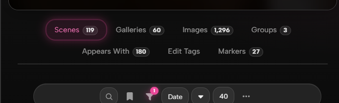
Hide the badges of scenes or/and performers in the grid view and the rating stars in the scene grid.
Hide the performers incl. images in the scene grid view.
Show the resolution and the studio logo in the scene grid view.
Hide O count (for example) in performer card grid view (and show e.g. another item from the profile).
Is it possible to add such optional changes in the settings menu? I would also modify the css, but there is more than one, so it seems a bit complicated for me.
This thread has many posts so my apologies if this was already discussed. I noticed the nav-tabs on the performers page does not display correct on mobile so I added this line and seems to fix it up.
The filter / saved filters pop up boxes can not be scrolled or selected on mobile in the performers or tags pages. Adding this line just below the added line above seems to fix it.
And not sure why this theme disables the filter badge so the filter can be dismissed without opening the menu but I prefer it on so I commented out line 163 in 09_buttons.css and seems to work fine. Maybe a preference thing.
Is the sidebar disabled in this theme? I cannot find the button to toggle it on/off.
In the Groups page (grid view), is it possible to make the cards vertical, as they were in the default theme? I think one of the main usages of groups is grouping the scenes from DVDs, and DVD covers’ top and bottom are cut off with the current view.