The performer cards are sick! Its eye candy! I’m considering getting a desktop just to run the full mode without lag (all or nothing) haha. Duplicate finder is much better now too. ordureconnoisseur if you were on the GTA VI dev team, we might actually get it before the end of the century with how quick you work XD
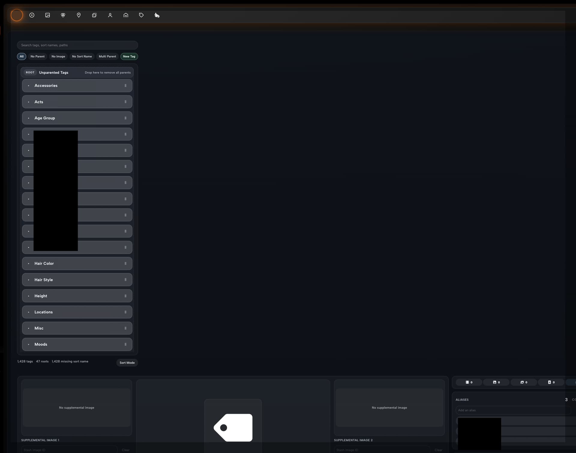
As I’m sure we are all aware, the default tagging in stash is not the greatest. So, personally I’ve tried a few plugins to fix this. Fast tagging, Easy tagging, however I’ve settled on ‘Edit Tags Overhaul’ (GitHub - RollainKraus/stash-plugins: custom stash plugins by RollainKraus · GitHub) Is seems to feature a lot of the basic ease of life features and be the most extensive that I’m aware of. Its design language is similar to this plugin too.
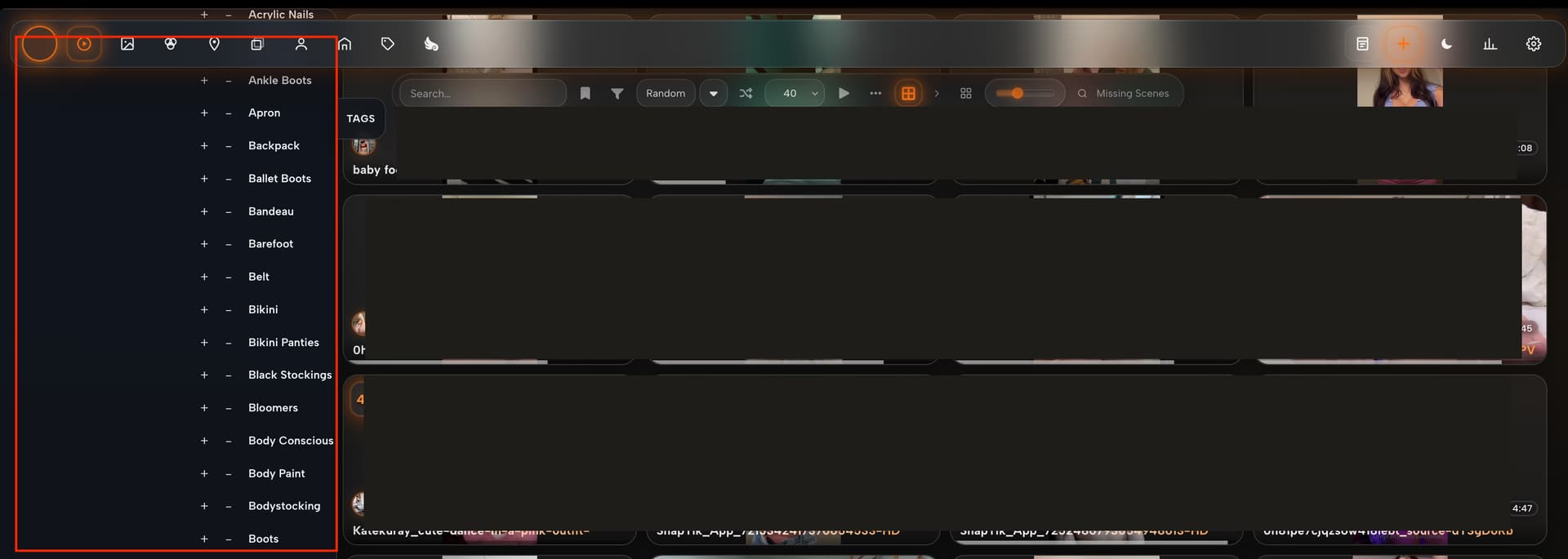
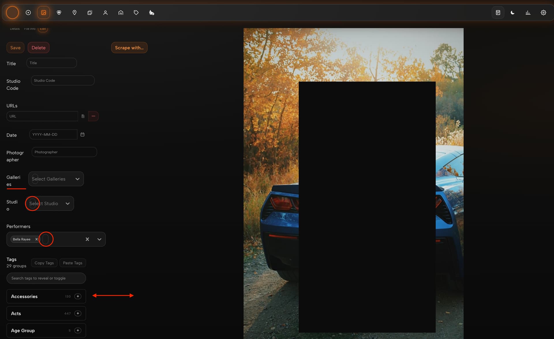
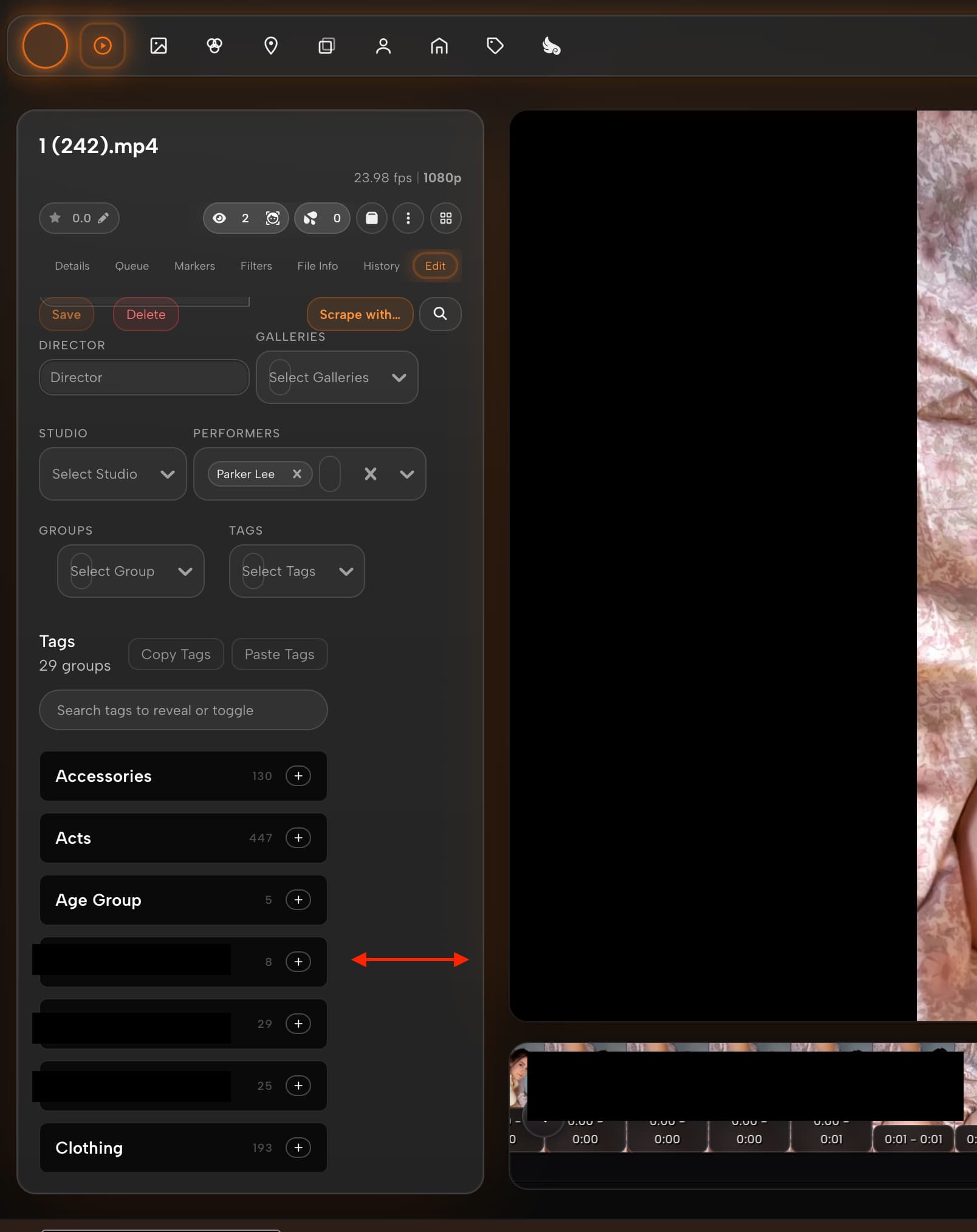
However, some of the layouts/scales/colors are a bit out of wack. I’m not sure if this is in the purview of this plugin, it is specific to this plugin, but ill make a post on their page too… I’ve illustrated some of these formatting and padding bugs below.
overhauled tag editor: (Info Layout is down the bottom.)
I used to have to switch off this theme to do admin stuff. But now I can leave it on and get most of it done. I Cannot understate the utility of the plugin drop down menus! This plugin has made huge leaps already. Its amazing to watch it develop first hand!
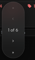
Rating banner incorrectly attached to studio cards. its exists mostly outside the bounds of the card, upper left corner. In terms of the active state glow for main navbar buttons, scene button glows when markers are selected. Is this intentional? Last thing, pagination bars for studios, performers, tags, groups appear vertically, taking up a lot of space. Only on scene page does the pagination bar appear horizontally.
One thing I’ve been running into: the home page is pretty janky on Windows with Chromium-based browsers (tested on Chrome, Brave, and Edge). Interestingly, Lite mode fixes the jank everywhere else but the home page stays sluggish even with it on.
I then tested on Firefox and the experience is completely different — almost as smooth as on iPad. So this seems to be a Chromium-specific issue on Windows.
I’m not very technical so I got some help diagnosing it with Claude, who helped me track it down with DevTools:
Removing the stash-liquid-glass class from <body> via console improves home page fluidity immediately, confirming backdrop-filter is the main cost driver
chrome://gpu shows full hardware acceleration (RTX 4070, D3D11), so it’s not a driver/fallback issue
The GPU log has repeated HLSLCompiler shader recompilation warnings, suggesting shaders aren’t being cached between navigations
Likely related to how Chromium handles backdrop-filter via D3D11 vs Firefox’s WebRender
My setup: 11,340 scenes. The home page loads several recommendation sliders simultaneously (scenes, studios, performers), which likely multiplies the backdrop-filter cost significantly at this scale.
On iPad the home page is smooth on both Safari and Chrome — same library, same content, no jank.
Thanks for the detail — the chrome://gpu HLSLCompiler note was the unlock. v1.13.0 is up with fixes targeting each thing you flagged:
Rating banner backdrop-blur stripped — every visible card was rendering its own live blur.
Slick-carousel cards had per-card paint containment + a rounded clip-path generating hundreds of compositor masks per render. Both removed. Also explains why lite didn’t help the home page.
backdrop-filter was using 22 distinct values, each compiling its own HLSL shader. Consolidated to 11.
Off-screen recommendation rows now skip layout + paint via content-visibility: auto.
Card tilt binding lazy-loaded via IntersectionObserver.
Also walked back lite mode — it had drifted into a nuclear strip that killed animations and the performer carousel. Now it just kills the GPU-expensive stuff (backdrop-blur, glow halos, card tilt) and keeps the rest. So if Chrome still feels heavy after updating, lite is a much smaller visual compromise than before.
Honest caveat: Chromium’s D3D11 just rasterizes backdrop-filter more expensively than Firefox’s WebRender no matter how clean the CSS is. Base mode on Chromium-Windows will still feel a touch heavier than Firefox.
Thank you for the report! All three fixed and pushed:
Studio rating banner — the positioning rule was missing .studio-card, so it rendered without absolute positioning. Added.
Scene button glowing on Markers — real bug. Left-nav prefix match was lighting up /scenes on any /scenes/* path, including /scenes/markers. Fixed to defer to longer-prefix nav items.
Pagination vertical on non-scene pages — .pagination-index-container was flex-direction: column. Switched to row.
Are you able to provide a screenshot? I was never actually able to recreate the error with the pagination buttons. As for the Tag Error with the home page scene cards, easy fix, should be live in a couple minutes
I had claude take a look to compare pagination bars across pages:
On /scenes: The pagination is actually row (correct) but it’s inside .pagination-footer which is flex-direction: column. No CSS rule is causing this — it’s Stash’s own .pagination-footer default style (margin: auto; padding: 0.5rem 1rem 0.75rem; width: fit-content) and the pagination-footer-container is a flex row, so the footer itself becomes a column flex container by default. The pagination pill inside renders horizontally but the footer wrapper stacks. Not actually broken — just the wrapper orientation.
On /performers: The pagination .btn-group is column because Refract’s own rule body.stash-liquid-glass [data-pager-row="float"] { flex-direction: column } is matching and forcing the pagination buttons to stack vertically. This is the real bug — Refract is setting flex-direction: column on the float row, which is the .pagination.btn-group on performers but a .pagination-footer wrapper on scenes.
On scenes the float row is .pagination-footer (a div wrapping the pill), so flex-direction: column on it just stacks the single pill — looks fine. On performers the float row IS the .pagination.btn-group directly, so column stacks the buttons vertically.
The fix in Refract’s CSS — the [data-pager-row="float"] rule needs to only apply flex-direction: column when the float row is a wrapper div, not when it’s the btn-group itself.
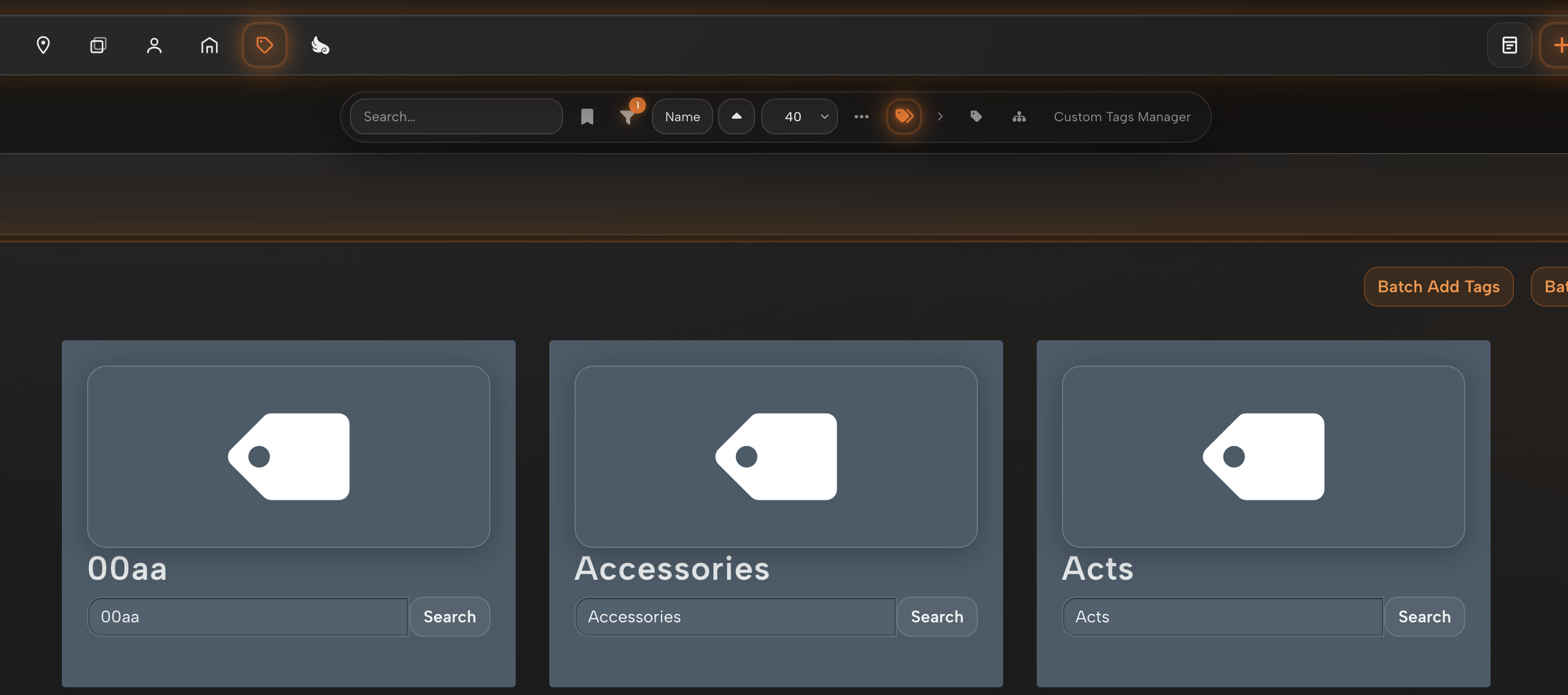
Homepage tag/performer pills fixed in v1.13.4: was a race condition between refract’s GraphQL response and slick’s carousel re-render shuffling card DOM nodes around. Update should be live shortly.
On the pagination, does this match what you’re seeing?
On my end it renders horizontally, and always has, on /performers /studios /tags /groups identically to /scenes. If yours looks different, mind sharing a screenshot? I want to make sure I’m fixing the right thing.
Thanks for the diagnosis - I implemented the code fixes you suggested above, but again, could never reproduce your bug on my end - please let me know if the implemented fix has solved it for you.
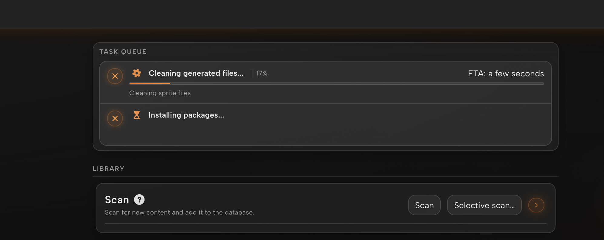
Fixed in v1.13.7. Queue now grows to fit all tasks. Each row is compact by default, click the chevron on a running job to expand its subtask list. Thanks for the report!
Fixed! Definitely something odd with the way tag cards are added to the home page in native-stash. Never would have caught this as tags are not an option in any of the premade filters! Much appreciated.
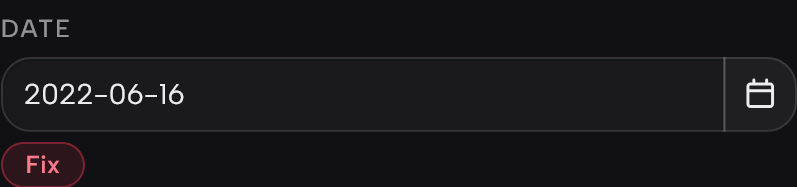
The date “Fix” button was the nasty one. After the first click it was getting disconnected from Stash’s own handler, so the second click just acted like a normal link and dumped you back on the homepage. Now it stays wired up, and the pill goes away the moment the date is valid so there’s nothing left to click by mistake.
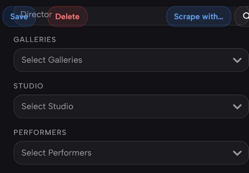
The Save/Delete/Scrape overlap was the toolbar losing its background. It stays pinned when you scroll the edit form, but without a solid backing the fields underneath were bleeding through it. Gave it a proper opaque background that matches the panel, so no more overlap.
Hard-refresh once the CDN catches up (couple minutes) and let me know if anything’s still off.
Side note, since you keep running into these: a lot of the rough edges come from refract having to dig into Stash’s HTML to restyle things, which breaks easily whenever Stash changes. I’ve been putting up some PRs on the Stash side to add real styling hooks, so eventually refract can use those instead of patching the DOM. Should mean fewer of these papercuts down the line. Keep the reports coming though, they help a lot.