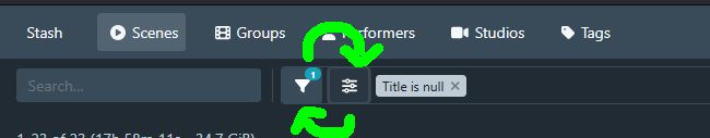
I tried the new addition of a togglable side panel in the scenes gallery, and I found confusing how the button to toggle was on the right of the one that allows to customize the filtering. I am no expert in UI/UX, but I think it would be more intuitive to not cross the movement of the mouse by positioning the toggle button on the left, and the filtering one on the right (which puts it also closer to the elements it directly edits).
I saw someone also suggest to put everything to the left of the search (or as part of the search), and make it the standard hamburger menu icon. But I don’t have an opinion on it.
I’m pretty excited about this release and I definitely think it’s a step in the right direction! I’ve stated my feedback below. For what it’s worth, I am a web/UX designer so I have a bit of experience with interfaces like this, but all of this is still my personal opinion.
Overall positives
I think the sticky sidebar is great, and easier to use than the centered search UI with the modal. It contains the most important attributes that I’d want to filter on, and it clearly reflects the current query state (although not completely - more on that below). Great work there.
Things I don’t like
As others have stated, there are now multiple ‘sources of truth’ for the query state, and they are not consistent. The sidebar does not state all active filters which makes it practically useless in some cases, and I need to use the modal instead.
One example is the tag count. One of my saved filters is set up for to-be-tagged content in my library folder, which filters on path=library and tag count=0. This is my default filter while I’m actively downloading and tagging content. While trying out the sidebar, I initially thought it was broken, because I couldn’t search for tags. The reason, I’m assuming, is that there are no scenes that can be queried where there is both a tag set, but there is also a tag count of 0. I love this exclusivity and I think this will ultimately lead to a better UX, but the fact that it did not tell me this in the UI is problematic.
Another thing that bugged me is the layout shift when toggling the sidebar. Because of my scene card width, toggling the sidebar changes the number of columns in the grid. I would try to optimize for this and scale the column widths according to the sidebar visibility state.
What I would change
I would put all filters in the sidebar, and have a toggle in the settings to use either the modal or the sidebar. This means you can remove one of the two filter settings buttons as well, and in UI, less is almost always more.
If having that many filters in the sidebar appears too visually ‘busy’, maybe add a section in the interface settings to show/hide different filters? I already do this with custom CSS, since I never need to filter on things like Checksum or Resume time.
I’d like an indicator of things that aren’t shown because of other filters (like tags because of the tag count). A badge like “x items hidden because of conflicting filters” would be an improvement already. Bonus points if you can show the specific conflicting filter there.
The ‘saved filters’ dropdown needs a different visual state to discern it from the other filters, as it’s a different level of importance than the individual filters.
The div containing the content (the one next to the sidebar) is targeted in a few different ways, for example .sidebar-pane>:nth-child(2) and .sidebar+div. I’d just give this element a class tbh.
Overall I like the addition and I think it’s a good direction to go in, but it does still feel a little incomplete and ‘patched-in’.
Mostly, love the changes and the work you do! Keeping it simple, and some is already mentioned so this is just another one mentioning it, here’s my feedback
Wants
Add quicker access button for changing between saved filters (Somewhere with the other filter buttons)
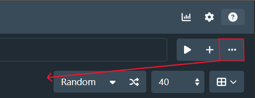
Changing views is now in a dropdown menu. Understand space saving, but there are only 4 and I toggle betwee and use them all regularly when sorting and cleaning.
Positioning of the “Options” button. Seems confusing having it there. I use very frequently when sorting in new files. Potentially move to here:
Most of the rest, I can say I like. Hard to mention specifics. Change is always hard, but I can see some of the benefits coming through to help with compatibility and future versions.
Hi! First of all thank you very much for all your work and the new design!!
It’s only a small thing and I’m pretty sure somebody will see it exactly the other way around but for me it’s kinda annoying.
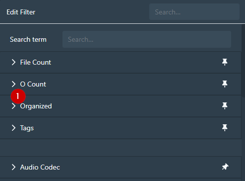
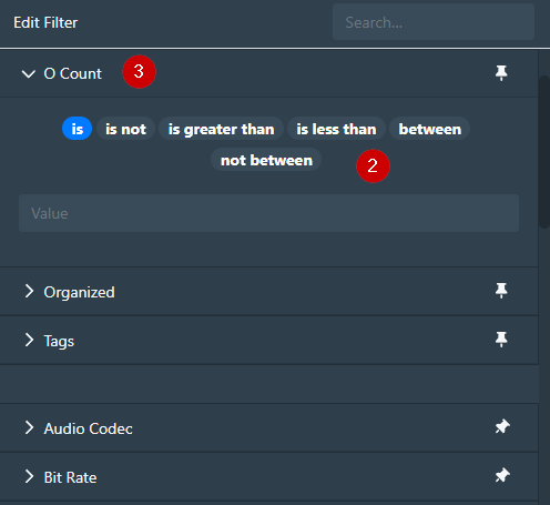
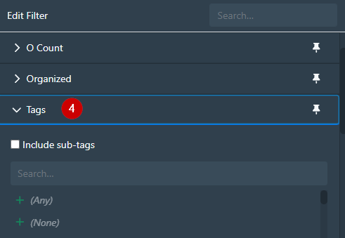
Open pinned filter in Scene filter dialog (1) makes two UI movements. Opens the filter details (2) and also moves it to the top (3). This are two UI movements and I in my world bad UI/UX.
Especially because it’s only works with the first opened pinned filter. The next one just opens (4) and do not the “move to the top” thing.
I would like the get rid of the whole movement thing.
I’d like to start by saying thank you to WithoutPants for all their hard work in maintaining this project generally, but also in working on UI/UX improvements specifically. UI/UX is notoriously hard to get right and this redesign is a huge step towards increased utility and functionality for filtering items in the database.
Many of the annoyances and frustrations that I have experienced with this redesign have already been discussed in detail, so I won’t rehash everything, but I have a few impassioned thoughts to share:
Controls are no longer clustered together. I preferred the controls area (e.g. search field, sort, display selector, result count dropdown) to be clustered together, so all controls are within easy reach of one another. I don’t think I have an opinion as to where the cluster of controls lives, but having them split and pushed to the outside margins of the page makes them extremely unhelpful to me.
Not all the filters are available in the sidebar. I have pinned all my most commonly used filters. It would be interesting to see all pinned filters in the sidebar while non-pinned filters would remain accessible via the filter modal. This feels like it would be an intuitive design, but I am just one user.
Too many clicks to get to filters. I would appreciate the return of the saved filters button in the main control section. Saved filters are how I manage subsets of items my library and the primary avenue for adding/maintaining metadata in bulk. Adding so many additional clicks is extremely annoying and dramatically reduces the utility of saved filters. There is plenty of unused space in the main control area so I expect that adding the button back would be a non-issue for most users.
Just to note – I understand that some of these complaints could be addressed via custom CSS. Typically software products will be maximally successful if it works for the most users out of the box, without requiring special knowledge or creating customizations.
My last feedback is about a topic I haven’t seen mentioned - the release process itself. I plan software releases professionally so this really jumped out at me.
It’s clear from your messaging that this revamped query page is most of the way there but not yet complete, and you need more input from a broader audience than those running dev builds to reach a finished state.
In a situation like this, where you have a slew of fully-ready bugfixes and smaller enhancements and a mostly-ready but not complete feature that you want broader feedback on, I recommend splitting these into two releases:
first, release bugfixes and smaller enhancements that have been well-tested and do not threaten to upend the user experience
then, release the additional features which might be a disruption to user experience or are not 100% ready for prime time.
This gives users the option to try the new features and provide feedback, and allow those who are unhappy with the new features to go back to the previous version while still receiving the benefit of all the bugfixes and enhancements you’ve worked so hard on. Users who don’t want to try the new features can simply not install the follow-on version. This strategy will likely make users happier and allow you more time and space to get feedback (and iterate!) on the mostly-ready but unfinished feature.
Obviously the genie is out of the bottle on this one, but something to consider for next time.
Again, thanks for your hard work on this project, and I hope the feedback is helpful.
I totally agree with you. What did you mean with remove the “sticky”?
I understand the mobile layout approach and why some of you (@alephalpha0, @pxrp) like the floating pagination at the bottom but for me I miss the pagination at the top in the menu. I work on a high resolution monitor and mostly at the upper part of the page (first or second row of the scene results). Always move the mouse pointer to the bottom for the next page is unpleasant.
A embedded pagination at the top in the menu would be my preferred way:
Another UI/UX surprise is the fixed menu. Scrolling down still show the filter input but not the controls like sorting or layout. Fixed menu like the scene list view would be great.
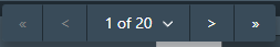
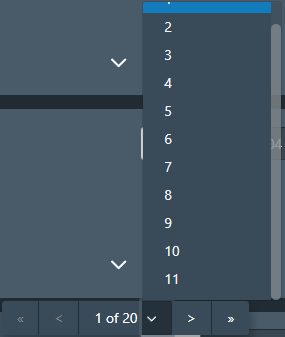
I know there is the number input way but a small movement with my finger (scrolling) and click on the desired page (e. g. 45) isn’t the same as moving my hand to the keyboard, typing a number in a input field and click okay.
I wish there would a way to configure a higher number of possible select options or even all pages available. Size of the select option drop down could be custom CSS but I don’t know if there is a way to to this for the page numbers.
I don’t actually like the pagination at the bottom, it is a waste of space. Shifting the paginator to another element caused the functionality to crash so I couldn’t add it to the custom script.
I am partial to this suggestion as well. I did like having the pagination available at the top and bottom of the page, but do REALLY enjoy having a sticky one, and think locking it like this is a great option.
Thanks for the helpful feedback. I am reading everything, even if I don’t necessarily respond to everything.
I’ve done another pass over the list page design and raised a PR to address the most pressing usability issues:
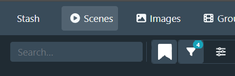
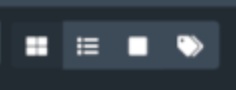
moved the sidebar toggle button to the left side of the button group, to more clearly associate it with the sidebar functionality
returned the saved filter dropdown button to the toolbar; it is grouped with the sidebar toggle and edit filter buttons
moved the sort/page size/display mode selectors to the left to cluster with the rest of the filter controls. The results summary is moved to the right on smaller viewports, and to the center on larger viewports
centered the operation buttons when selecting scenes. This should reduce mouse travel for more common operation use cases
Things that are still on my TODO list to address in some form in the short term:
maintain sidebar state so that sections stay open when navigating away and back to the scenes page
style the Saved Filters section differently to distinguish it from the other filter sections. I’ve tried a couple of options (adding an icon, changing the text colour to blue or muted grey), but have been unhappy with it. I don’t have a good idea for this currently
reassess the view selector dropdown design. I didn’t anticipate that changing the view was going to be such a frequent occurence that it would cause as much friction as it did
I don’t have specific plans to readd pagination back to the top of the page currently, but I’ll keep an eye on how it impacts usability and might revisit later.
To address some specific points:
This was mostly related to effort, but also related to the drill-down style design that I ended up going with. Some filters aren’t really suitable for the drill-down style that I imagined for the sidebar design. The intention was to put more common criteria into the sidebar so that the dialog would be for more specific or advanced use. This relates to a redesign of the filter dialog as well, which I’ve posted about previously.
I wanted to include what I figured to have the most utility for the most users (and myself naturally). Finally, adding a configuration to include/exclude and order criteria was something that would take a chunk of effort to do, so it’s not something I wanted to include in the initial version. I would like to hear which criteria people would most like to see in the sidebar so that I can prioritise those.
This was actually a bug and has been fixed on develop and will be in the next bugfix release. That behaviour was supposed to only trigger when clicking on a filter tag to open the dialog and show that criterion.
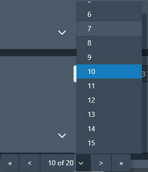
From memory it was so that you had a clear picture of the current place in the page list. I’ve bumped this up to 1000 on the develop branch and that will make it into the bugfix release as well.
Again thank you for the feedback and your patience while I refine the design.
Echoing everyone else’s gratitude here; @WithoutPants your work on this project has been a huge QOL improvement for me and my partner.
On the whole, I like the updates. Definitely good to have a less-comprehensive (i.e., overwhelming) filter dialog. My suggestions:
Keep the search box on-screen at all times: When the viewport is narrowed to less than 992px wide, .search-container is hidden from view, and can only be accessed via toggling the sidebar. I personally always want the search box within reach. For narrow viewports, maybe you could do something along the lines of:
See here for illustration (of both this and the next point). Might be best to keep it expanded after the user hits “enter”, and collapse it only when the user clicks on .filter-section.
Maybe even set the <input placeholder="..."> attribute to “” when collapsed?
Improvements for mobile: The sidebar appears to be wider than the viewport itself; it should be set to a max of 100vw. Also, having the sidebar take up the entire viewport affects the UX of the searchbox: hitting “enter” doesn’t do anything (since it’s live search / search-as-you-type) when it should really “take you to the results” (which are technically on-screen already but concealed by the sidebar).
I’m not a FE guy so I don’t know how advisable this is, but maybe pressing “Enter” could collapse the sidebar when it’s >50% of the viewport width (or some other sensible threshold)?
Swap sidebar contents with filter modal: The filter modal shows an exhaustive list of filters, whereas the sidebar shows a limited selection. Perhaps it should go the other way around?
My reasoning is that the sidebar only looks like a sidebar on desktop, and that’s where you have the most screen real estate to display the exhaustive list (vs. mobile, where it takes up the whole screen and thus is not that different from the modal). Modals invite less extensive interaction, because they are meant to momentarily obstruct the main content, whereas sidebars live persistently alongside it. eBay does it this way, and when your main content is long enough to scroll through, I think it works well.
Bonus request #1: Search box on frontpage? (Should search for scenes, obvi.)
Bonus request #2: Display recent searches in search box dropdown
Bonus request #3: For convenience/discoverability, frontpage carousels for:
Continue watching
Saved filters
A “Random” variant for scenes, studios, performers, etc.
That’s all I got. Thanks again for making the homelab kick ass. This is one of those very exceptional cases where the self-hosted FOSS alternative has killer features that the mainstream/commercial options never will.
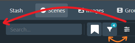
This is a silly detail, but, any thoughts about changing the sidebar expand/collapse icon to something more conventionally associated with opening a sidebar (like FA chevron, caret, or square caret, or a hamburger or ellipsis)? I find myself clicking on the sliders icon when I mean to click on the funnel icon, I guess something about the sliders says “edit filter” to me more loudly than the funnel.
Reordering the icons is good call and I’m sure will help too.
Possibly shortening the search bar as more filters get applied to avoid filter truncation up to a minimum search bar size. This would help when searching long titles, file names and modifiers imo
I also prefer the old button layout for the display swap:
Now it takes more clicks to do the exact same thing and it just adds more unused blank space.
I mainly use Stash on mobile and the one thing I don’t like about the new design is that text search is now much more inconvenient. Previously you could just tap the search bar on top of the page, type and it would automatically search. But now:
The search bar is buried inside the sidebar - requires two taps - one for opening sidebar, and one for focusing the search bar.
You have to press Show X results to view results - another tap.
You have to repeat all of the above every time you want to change the search query a bit and see what results it returned.
I feel that the search bar is such a commonly used feature that it should be easily accessible on mobile.
The 2nd row of buttons is driving me mad, mainly because they disappear as soon as you’re away from the top of the page. Getting in/out of tagger requires returning to top of page every time.
Ideally I’d like to place them with the other buttons on the right and shrink that damn full length bar that’s displaying (or not!) filters.
When I select an item, i’m now navigating to the center to interact. Maybe aligning this towards the left where the obvious ‘select all’ is to save going left and then center again.
There’s a lot of mouse movement involved now to do joined up things. I’m not against the change, it’s feeling slicker having the sidebar (I mostly work with vertical sidebars in browser now) it’s just a little disjointed at the moment.
In case you missed it, @IAmKontrast, @pxrp, @gerradynn: as of 0.29.3, the pagination control is now included (albeit hidden) at the top of the page. This CSS will enable it:
 ” when collapsed?