This topic is intended to consolidate any feedback, pain-points and bugs, suggestions etc related to the query page redesign currently confined to the scenes page in 0.29. Feedback will be used to refine the design as needed while rolling out these changes to the other query pages in 0.30.
As a recap, these changes introduce a toggleable sidebar providing filter component to more quickly filter scene results. The performers/tags/studios shown in the sidebar are filtered by the current results, ie you will only see options for which there are scenes that match.
The sticky pagination is something I’ve been wanting for a while now in stash.. Good job. Overall, I’m for the new design and functionality. Looking forward to this release!
What I like:
1 - The floating toolbars (top and bottom)
2 - The new sidebar filters are a great addition
Dislike:
I use the custom filters quite often and the fact they are now hidden in the collapsible sidebar is a step back in usuability (from my perspective)
There’s a lot of empty space (on a desktop browser) at the top near the ‘Created at’ drop menu where it could be added.
I also use the custom filters a lot. Initially, I thought it would be a step back but as long as the sidebar is toggled on, the amount of effort to apply a custom filter is the same, if not easier. The downside is that the dropdowns will collapse again which is annoying.
I like the sidebar filter a lot. If you could persist the open and close states that would be great, it would reduce the clicks to apply a filter by half.
I like the floating pagination component at the bottom.
For the features circled in the image, I actually liked the previous implementation better. If you could stack those centered vertically and sticky the toolbar, that would be great. When the selected filters are all on the same line as the create scene/select scenes toolbar it feels like a lot of effort to go to the end of the bar to do that (especially with the addition of the filter sidebar on the opposite side of the screen) when previously it was nicely centered and easily accessible.
This is very cool, the drill-down was the one feature I was missing from my own custom-built solution.
But when using the tag filter in the sidebar, after selecting the first tag, and clicking the “+ Sub-Tags” thing, I can only see or search for directly tagged tags with the text search, not parent tags not directly tagged on any matching scene. I have to use the “Edit Filter” dialog to add those filter tags. Is that intended behavior?
One small suggestion: the sidebar seems to use a fixed height for the selectable tag list (allowing for maybe 10 tags to be visible at once), while simultaneously having a lot of unused space below the last sidebar element. it would be cool if it was able to use the full height to display more items. I know scrolling elements with flexbox dynamic sizing can be a real pain, though.
I wish saved filters list was still accessible by one click like before as I use saved filters all the time. Now instead of one click I need to open a side bar, open list and close the side bar to not waste the space.
These are the things that users will likely want to do at any time, and should not require scrolling to access.
Just so I understand, was the idea to make Stash more mobile-accessible? Because instead of scrolling (which I’d just press Home/End key), stuff I usually do feels like it’s increased click count + more mouse distance. And more of the vertical viewpoint is being used by UI control elements than previously.
I know that UI designing is a huge pain, and there’s really nothing “wrong” with this new change, so please take this as simply as ideas.
It’d be nice to be able to disable the sticky on scene-list-toolbar if it’s not too much effort. Could be done with styling scripts of course, but I think others might want it as well, just for the extra vertical space.
Pagination: if list-results-header is in current viewpoint, why not put it there in the middle? Only into pagination-footer when scrolled downwards, or if there’s not enough horizontal space available.
Play button: am I using it wrong, or does it simply just load the scenes page for the first result?
PS: I quickly removed the sticky from those two elements, and I’m suddenly feeling happy with this change (other than pagination is lacking from the top). So keep it up, cheers!
I appreciate the ongoing development, but I’m not a fan of the new UI changes. I strongly believe this should have been released as an settings>interface flag rather than a default change.
Main concerns:
Dual filter locations: There are now two spots to manage filters—a sidebar and a modal. The sidebar shifts the entire page on open/close, resizes every image and text box, and can shift grid views from 4 columns to 3. It doesn’t even contain all the filters, so you still need the modal, meaning two things to close. At least the modal filters remain functional so the sidebar can be avoided.
Saved filters: Moving saved filters to the sidebar is a significant regression in usability. What was previously ~2 clicks is now 5 clicks to access a saved filter.
Mobile/responsive issues: The filterbar and wall view appears broken or untested on mobile displays, with layout issues that make navigation difficult.
Ultrawide display issues: The scenes per page and other controls are now too far right, which is annoying for ultrawide monitor users.
Extra clicks: The wall/list/grid/tagger icons + slider are now hidden in a dropdown, adding unnecessary clicks and interactions. A slider in a dropdown is particularly awkward.
Overall: There’s a lot of wasted space and extra clicks with these changes.
Thank you for the feedback so far. My focus in the near term (after addressing immediate bugs) will be to address the usability issues for saved filters which appear to be hitting a large number of users. I’ll also try to look at improving the layout for ultrawide viewports.
This is a corner case I hadn’t considered. I’ll try to look at this before the next minor release. It’ll be largely dependent on how easy it is to implement.
Not specifically no, but it was a factor. I found scrolling to the top to access these operations tedious. A frequent example of this was editing or deleting a selection of scenes that weren’t near the top of results list.
If Auto-start video when playing selected is false, then that’s the behaviour yes.
I’m going to need more information/examples for this. I’ve been running these changes on my personal server for a while and haven’t noticed any specific issues.
I agree with most of the points made so far, particularly the saved filters ease of accessibility. I’m largely a fan of the new interface! Only issue I have that I don’t think has been mentioned yet is when using a mobile device, the search bar is no longer visible. It requires opening the sidebar to access. My recommendation would be to have it hover at the top instead, but it’s not a show-stopper.
I want to be honest about my experience: I’m downgrading to 0.28.1 for the time being, despite all the other improvements and bug fixes in the release.
Main pain points:
Dual filter locations: The sidebar + modal split is confusing. The sidebar shifts the entire layout (resizing images, changing grid columns), but doesn’t contain all filters anyway. I still need the modal, so now there are two things to manage. I’d remove it myself, if not for…
Saved filters: These moved to the sidebar, which adds extra clicks to access frequently-used filters (went from 2 clicks to 5 for me).
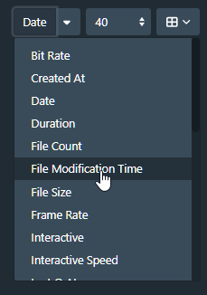
View controls: The grid/list/wall buttons and zoom slider are now in a dropdown. For controls I use constantly, the extra click + having to use a slider inside a dropdown feels awkward. I also don’t really know what issue this solved?
Layout issues: On an ultrawide monitor, controls are pushed far right requiring lots of mouse travel and eye movement/strain. On mobile, all the extra clicks is frustrating, the slider was already difficult to use.
I really appreciate all the work that goes into Stash, and I understand these are subjective preferences. I think my main feedback is: this feels like it should have been an optional UI mode in settings, or a UI Plugin , at least initially. That way users could choose which interface works better for their workflow while you gather feedback.
I know this is volunteer work and I’m grateful for it. Just wanted to share honest feedback about how these changes impact my daily use.
This was the point I was specifically looking at more detail about. I wasn’t sure what you mean by the filterbar and wall view appearing broken on mobile displays.
Primarily it was to make more efficient use of space. I didn’t figure it was such a frequently used control as to make it onerous. This is a useful data point regardless.
I appreciate all the work done here. The only feedback I have on the redesign is the tagger view is hidden in a dropdown so it’s an extra click. Otherwise so far so good!
Wall view is not something I use often on mobile, but because the menu and slider are finicky on mobile and I was testing, I went into that view - I noticed that the zooming nature of the new wall view would cover elements below - and awkward ways - like it would cover half the menu. It was all just too much for my device to handle. But again, its not something I use. Thanks.