As the year comes to a close and my annual end-of-year leave has approached, I’ve found more time to spend on one of my favorite hobbies, fiddling around with my Stash and looking for ways to improve the experience. My mass-collecting habits came to a crawl in the fall of this year. Now, much of my time in Stash tends to be spent on polish. My most recent project has been around the sidebar experience. I’ve read through much of the feedback shared with the community, and sympathize with many of the sentiments expressed in the Query page redesign feedback thread topic.
For context, I operate my Stash on a 32:9 1440p monitor where my Stash window occupies 1/3 of the screen space. Here is how my Stash is rendered in that space.
The distance between the far left and right sections ends up not being as great. That aside, there is relevant grouping between the buttons in each section.
Sidebar
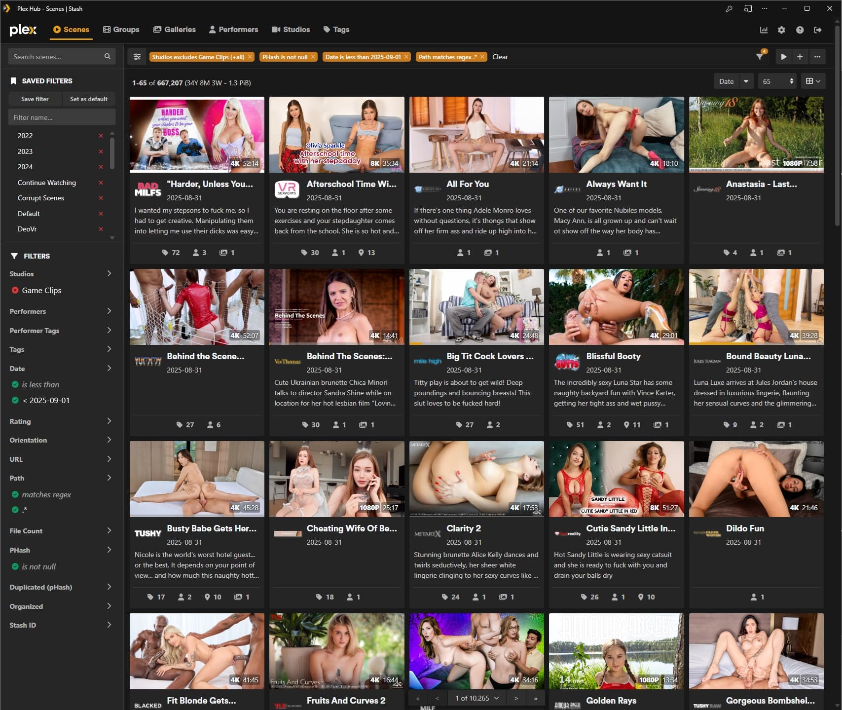
Search is core to my experience in Stash. Against better judgment, I aimed to archive most of this form of media sometime during the pandemic era, resulting in the acquisition of an extensive library. So, having an area dedicated to this function, efficiently filtering through this massive collection, was a big quality-of-life improvement. Similar to how we could previously query content using the search box and quickly adjust the search parameter based on the results returned, we can now do this with filters. No need to jump in and out of the edit filter window to adjust the query based on the results.
This section and its grouping are almost perfect. You’ll see I’ve made some additions to the original design. I split the sidebar into three different segments.
- The top being the list search, which really hasn’t changed much from the original, aside from the demarcation at the bottom, the improved placeholder to make it clearer what the input box affects, and the addition of the magnifying glass (mostly an aesthetic touch), which is replaced by the clear button once a user starts typing.
- The next segment is for saved filters. Having it near the top as a quick shortcut to bypass manual filter edits made a lot of sense. With the real estate provided by this dedicated area, there was little reason to have it collapsible.
- Finally, there is the filters segment where new filter combinations can be created. You’ll see I’ve ported over several additional filter options that aren’t currently available in the main repo. Pull requests haven’t been created to include these in the main repo, as I get the sense that the idea is for these filters to have a unique flavor compared to what’s offered in the Edit Filter window. Some of these new filters do in fact have a unique twist, but some, like Phash, URL, Path, and Date, would be a greater challenge to incorporate a unique style without limiting the function. So I’ve simply ported them with the same design from the Edit Filter window. The reason most of these likely weren’t all made available in the same form from the Edit filter window may be due to the fact that the list will automatically update as you make a change, which can initiate incomplete queries, similar to the search field. But honestly, I don’t see this as a problem.
On a desktop monitor, each segment would be fixed to the screen, and overflow could really only be triggered in the filters segment. This will ensure the list search box and the saved filters segments are always accessible.
There is still some room for improvement here, even with the work done so far. Some of these improvements center around grouping. The clear option is still disjoint from this area, requiring navigation to the far top-right to access it. I’m thinking I’ll add a fixed “clear all filters” button to the bottom of the sidebar to address this. On a similar note, I’ll also be adding a button to access the filter menu in the sidebar once it is expanded. I have a few thoughts on how this could be elegantly done.
Toolbar
With the search function now having its own dedicated area, the toolbar will primarily aid consumption of the filtered content. The top bar keeps the user informed of the content they are actively browsing. Below it on the left side, the pagination index and stats info are aptly placed next to the sidebar to ensure the results of each query are easily trackable at a glance. I went ahead and further emphasised the critical parts of the text to further improve trackability. Finally, the placement of the sort, page size selector, and view options to the right of the page seems reasonable. The reality for me is that these are set-it-and-forget-it buttons and are used very infrequently. For everything but images, the buttons are really only used when I’m creating a new saved filter. Given the size of my image library, images are not queryable. I only access images through the galleries they are contained in. From there, I may occasionally jump from the wall or card view, although I mainly browse from the wall view.
Pagination
This one has always been very interesting for me. It’s always seemed counterintuitive to have the pagination at the top of the page. Very early on, after discovering Stash, the top pagination was one of the things I hid with the main goal of removing the button clutter that was present at the top of the page. If a user is scrolling down a list, their mouse should naturally be hovering near the bottom of the page, making a bottom pagination ideal. For me, the exception to this is only when I know from the start that I would need to jump a few pages if my list is sorted in alphabetical order or something, and I know my destination is a few pages in. The sticky placement of the pagination at the bottom of the page provides the best of both worlds, as when I hit that second case, the mouse movement is only necesary once, then I can quickly jump as many pages as I need before I start scrolling down the list naturally. Aside from the styling suggestion I proposed to give the pagination a hover effect, no additional changes were introduced in my instance.
Reflecting on the old design
I can appreciate the convenience that the old design offered by placing all the buttons in a central location for ease of access. However, I’ve always found this to appear unorganized and very visually overwhelming, especially on smaller screens, where it results in several rows of buttons to get through before a scene can be viewed. This was the first area I attempted to touch up after discovering Stash and learning that custom styling was an option. I can understand the desire to maintain the status quo and roll back to this design. It is a bit disheartening, though, to see that in #6322 the design is being rolled back with the addition of more buttons, such as the new scene and play buttons.
Pleasing everyone without a fully modular interface is always going to be difficult. To that end, I decided months back that I would continue to maintain my own take on this layout as Stash continues to evolve. But if I were to offer an alternative idea to address the main feedback on travel time, I would suggest limiting the maximum width Stash could expand out to. Every site will encounter the issues discussed here beyond a certain width. Most sites cap the maximum width at which they render content. With my 32:9 monitor, I will very occasionally expand the window to fill the full width to admire the density of the collection, but I would never dare to drive that width regularly. This suggestion likely won’t be very popular, but I think such a change may be inevitable.