I took the liberty of splitting off the global search discussion into a separate topic, to keep things on topic here.
I agree with this and I don’t think you’re overthinking it. Having spent some time with the new UI, I’m still a bit unhappy with the current design.
Agreed. This needs further reworking.
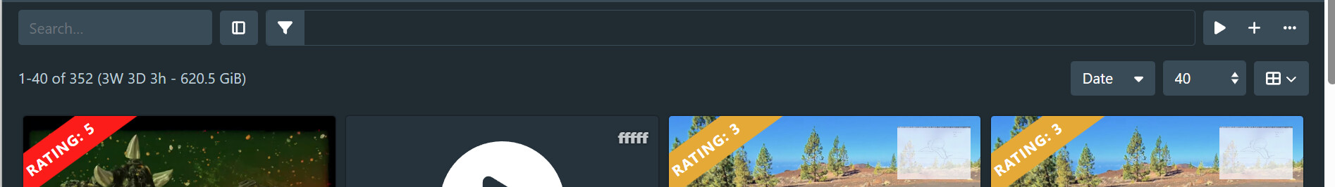
The first thing that needs to change is that the filter icon needs to open the filter dialog, to be consistent with other query pages.
I’ve also come around to QxxxGit’s take on the search input, quoted below:
That last sentence is important, and suggests putting it in the sidebar is probably not ideal.
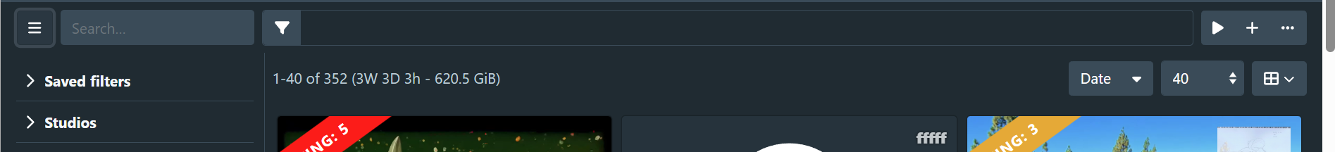
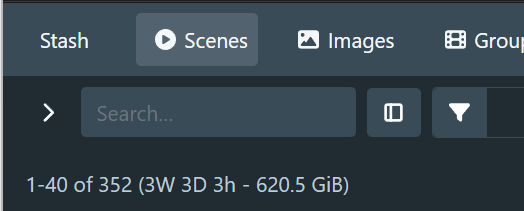
I’m trying out a design where the sidebar appears under the query toolbar, so the toolbar extends all the way to the left side. I re-added the search input to the toolbar and made the filter button open the filter dialog. I then needed to figure out where to put the toggle sidebar button, a problem that has been plaguing us since the beginning of the design.
We want the button to be located close to where the sidebar opens, and ideally it should be grouped with the rest of the search controls. I just can’t seem to find a good place for it. Here’s some screenshots where the sidebar toggle is on the left-most side.
Sidebar open:
Sidebar closed:
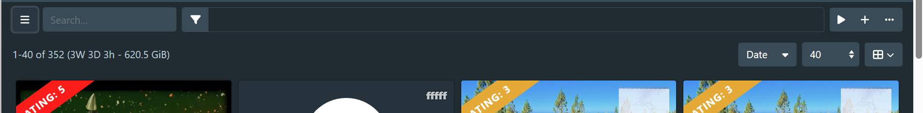
Sidebar closed, page scrolled
One using minimal styling:
With a chevron icon:
Moving the toggle button to the right of the search input:
I think the overall look is a lot more consistent with the other query pages, I’m just not happy with the placement of the sidebar toggle button.
We could also potentially have the search field collapse into a query button, but I’m not sure if it would help the overall design or not.