 |
Summary | A customisable redesign of the scene cards for Stash. |
 |
Repository | GitHub - Valkyr-JS/ValkyrSceneCards: A rework of the scene cards for Stash. |
 |
Source URL | https://valkyr-js.github.io/stash-plugins/index.yml |
 |
Install | How to install a plugin? |
Features
- A highly customisable config allows you to display your desired data and hide the rest.
- Display performers as a gender-coloured text list or a collection of customisable avatars.
- Minimal styling for maximum theming compatibility.
Requirements
To use this plugin you must be running Stash version 0.26.0 or higher. No other dependencies are required.
Installation
- In Stash go to Settings > Plugins.
- Under Available Plugins click the Add Source button.
- Fill out the fields in the popup form. The Name and Local Path fields can be whatever you like, but the Source URL needs to match the URL below. I recommend the following;
- Name: Valkyr-JS
- Source URL: https://valkyr-js.github.io/stash-plugins/index.yml
- Local Path: Valkyr-JS
- Click confirm and you should see a new line under Available Plugins called “Valkyr-JS” (or whatever you entered for Name in the popup). Click this and you’ll see my available plugins.
- Check the Valkyr Scene Cards checkbox and click Install in the top right of Avaialable Plugins.
- (Optional) Configure the plugin via the Plugins panel below Available Plugins. For example, to enable the performer gender colours, under Valkyr Scene Cards toggle Display performer names in gender colors on.
- Go to the scenes page or home page and you should see the cards styled differently. You may need to refresh the page to see the changes.
Configuration
Performer avatar setup
By default, the plugin displays scene performers as text. The Plugins page allows you to replace this with a list of avatars.
- To enable avatars, in Stash go to Settings > Plugins.
- Under Plugins, scroll down to Valkyr Scene Cards.
- Enable the option titled Display the performer list as avatars.
Returning to any page with scene cards, you should see the performer list now displaying as a series of text-based avatars, showing the performer’s initials and their gender icon behind it.
Profile image avatars
Performers’ profile images can be used in place of the text-based avatars by enabling the option titled Use performer profile images as avatars. The top square section of the profile image is used, so results may vary depending on each image.
If a performer has no profile image - i.e. it uses the default Stash profile image - then the default text-based avatar will be used.
Custom image avatars
You can use a custom image for each performer’s avatar with some setup.
- In Stash, create a new tag. The name doesn’t matter but take note of the ID.
- The tag ID can be found in the tag profile URL; it’s the number after
/tags/. For example, in the URLhttp://localhost:xxxx/tags/1731/scenes?sortby=date, the tag ID would be1731.
- The tag ID can be found in the tag profile URL; it’s the number after
- Go to Settings > Plugins
- Under Plugins, scroll down to Valkyr Scene Cards.
- Click Edit on the option titled Set tag ID for custom performer avatars.
- Enter the ID of the tag you created.
- Add your custom image/s to your Stash if you haven’t already done so.
- Tag each image with the tag you created, and also tag the associated performer.
Returning to any page with scene cards, you should see the performer list now displaying your custom images for the performers that you have made. If a custom image hasn’t been created for a performer, it will fall back to the default text-based avatar, or use a profile image avatar if you have enabled it.
Styling
I’ve tried to minimize the amount of theme-based styling such as colors, font appearance, etc. so that the cards are as compatible with theme plugins as possible straight out of the box. Where this couldn’t be achieved, I’ve used CSS variables for easier custom styling. They have the following default values;
:root {
 --vsc-font-sm: 12px;
 --vsc-performer-avatar-bg-color: rgba(0, 0, 0, 0.6);
 --vsc-performer-avatar-initials-size: 18px;
 --vsc-performer-avatar-size: 60px;
 --vsc-resolution-icon-bg-color: #f5f8fa;
 --vsc-resolution-icon-color: #30404d;
 --vsc-top-line-opacity: 0.8;
 --vsc-preview-background-backdrop-filter: blur(10px);
 --vsc-preview-background-color: #000;
 --vsc-gender-color--female: #f38cac;
 --vsc-gender-color--intersex: #c8a2c8;
 --vsc-gender-color--male: #89cff0;
 --vsc-gender-color--nonbinary: #c8a2c8;
 --vsc-gender-color--transfemale: #c8a2c8;
 --vsc-gender-color--transmale: #c8a2c8;
 --vsc-gender-color--unknown: #f5f8fa;
 --vsc-performer-overflow-border-bottom: 1px dotted #f5f8fa;
}
To adapt them, copy and paste the above into Settings > Interface > Custom CSS (make sure the Custom CSS enabled option is on), then change the values as needed. This will override the default values.
If other variables are required, please raise an issue on the Github page. Variables will only be created where beneficial. For example, this plugin does not change the card’s native border-radius, so adding a variable here serves no purpose.
Tag banner configuration
Tag banners can display a particular tag as a banner below the scene cover to make them stand out. See the screenshots section below for an example.
Configuration data
The tag banner configuration data is structured as an array of JSON objects, and example of which is as follows;
[
  { "tagID": 1, "className": "vsc-tag-banner--male" },
  { "tagID": 2, "className": "vsc-tag-banner--male", "displayName": "MMF" },
  { "tagID": 3, "className": "vsc-tag-banner--female" },
  {
    "tagID": 4,
    "className": "vsc-tag-banner--unknown",
    "displayName": "FFF"
  }
]
Each object has the following key/value pairs;
| Property | Required | Description |
|---|---|---|
"tagID" |
Yes | The ID of the tag you want to display. |
"className" |
Yes | The CSS class to apply to the tag for custom styling. |
"displayName" |
No | Replaces the tag name with the provided text. |
If you are unfamiliar with JSON, use the example above as a starting point and modify it to your requirements. All property keys, as well as the values for "className" and "displayName", must be wrapped in double-quotation marks. The only one that isn’t is the "tagID" value.
The order of objects is important, as the object closest to the top will take precedence over others. For example, if using the configuration data above and a scene has tags 2 and 3, the scene card will display the information for tag 2 as it appears first in the configuration data list.
To update the tag banner configuration:
- Minify (i.e. place on one long line) your configuration data. You can use a free tool like JSON Formatter for this.
- Navigate to Settings > Plugins.
- Under Plugins, scroll down to Valkyr Scene Cards.
- At the bottom of the options list, click “Edit” under Tag banners.
- Replace any existing data with your new data and click confirm.
CSS classes
The plugin comes bundled with several simple CSS classes created to work with tag banners:
vsc-tag-banner--femalevsc-tag-banner--intersexvsc-tag-banner--malevsc-tag-banner--nonbinaryvsc-tag-banner--transfemalevsc-tag-banner--transmalevsc-tag-banner--unknown
These are named for the gender options in Stash, and use the associated CSS variable for their background color. For example, the vsc-tag-banner--female class uses the value of the --vsc-gender-color--female CSS variable.
You can create and use your own classes by adding them to Custom CSS under Settings > Interface.
Screenshots
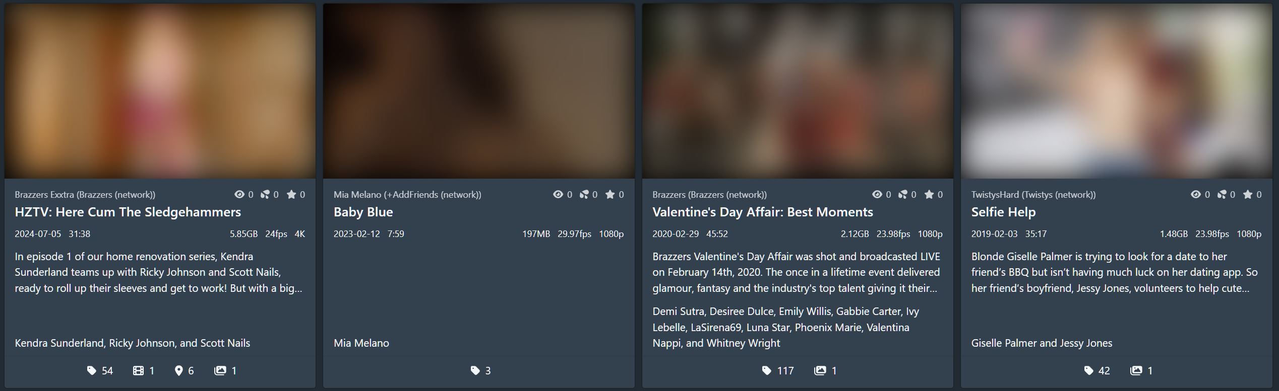
The default layout.
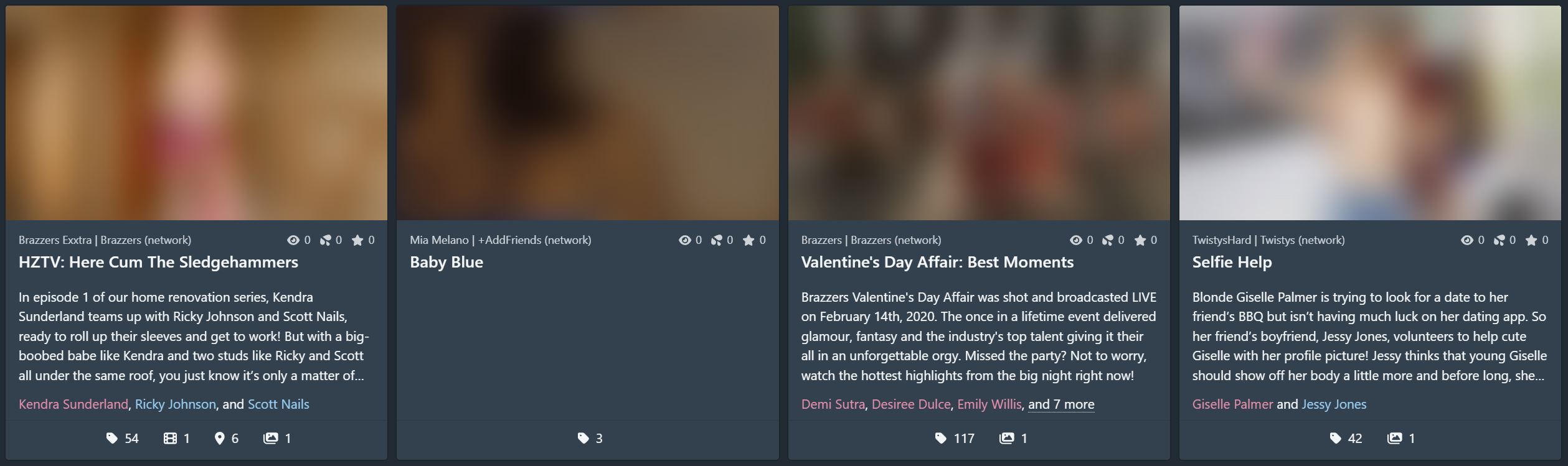
A customised layout with a 5-line description, a gender-coloured performers list, and some hidden info.
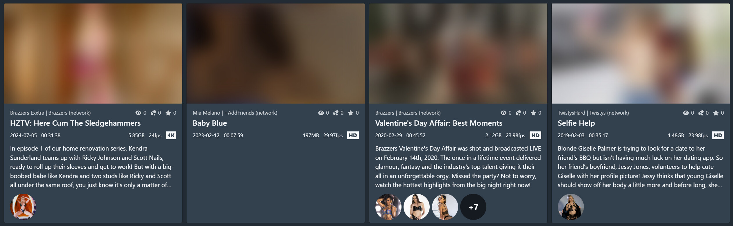
Another customised layout featuring a profile image avatar performer list and hidden footer info.

A minimal layout featuring only non-hidable info.

Tag banners.