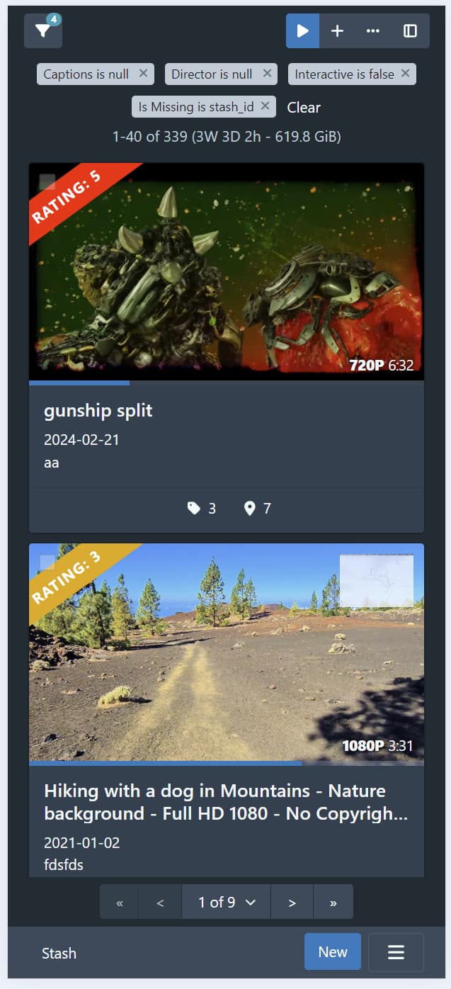
I don’t think there’s room to show filter criteria in the toolbar on mobile devices. I think it’s more important to have access to the other buttons on these smaller viewports. We can have the filter criteria at the top of the page per existing behaviour, and ensure we have the count badge in the filter button. This is the rough idea:
In any case, I’m going to push the filter tag stuff into a PR separate from the rest of the toolbar stuff, since whichever way we go, it’s a chunk of changes on its own. For the time being, I’ll leave the filter tags at the top of the page.
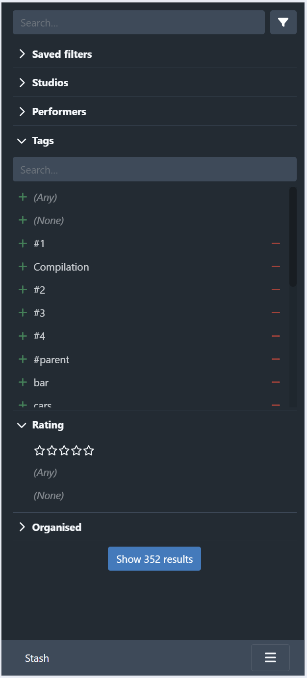
I’ve been working on the presentation for mobile viewports. The current state is much like the above screenshot (I’ve yet to add the sort/page size/display mode controls back in). The sidebar currently looks like the following:
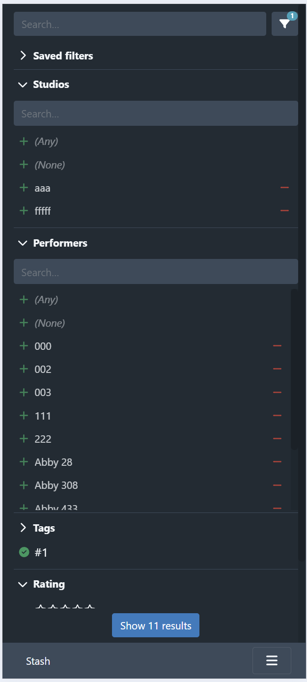
The button to close the sidebar is at the bottom, showing the number of results. It sticks to the bottom of the page:
An alternative is to fix the close button to the bottom of the screen:
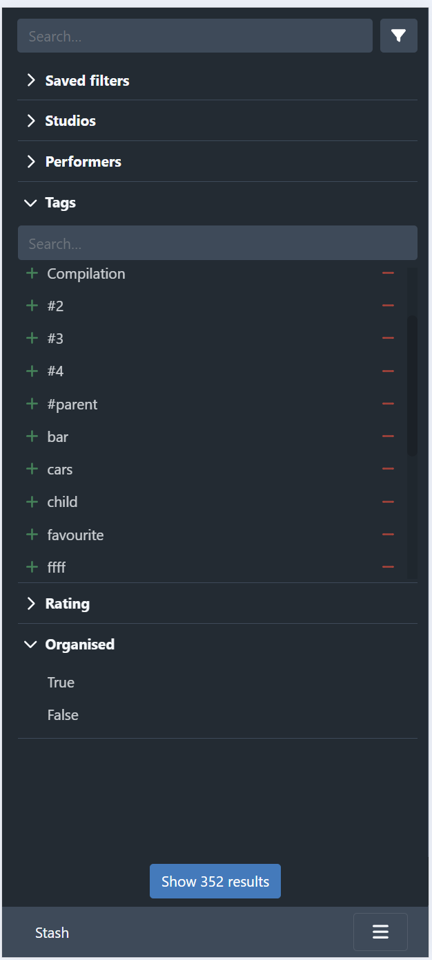
I probably prefer this positioning as it gives the user a fixed (and easily accessible) place to close the sidebar. It needs a bit of css hacking to get it positioned correctly though.
Having the filter button on the toolbar and the sidebar feels a little redundant on mobile screens, and I suspect it might also be a cause of confusion for users. I’m not sold on having the filter button open the sidebar, and only have access to the edit filter dialog via the sidebar, as it adds an extra click for users that want to edit the filter directly. Ideally, the sidebar would cover 90% of the use cases for querying, with the edit filter dialog covering the remaining “advanced” cases. It’s not there yet, so perhaps when its like this in practice we can consider changing the flow on small devices.