After submitting the main custom fields PR, I worked on getting some filtering for custom fields in the UI.
I needed to spend a bit of time refactoring the UI-side filter criterion code, which has been a bit of a pain for a long time (and undergone many iterations and refactors).
After that, it was getting something workable in the criterion editor UI. I’ve mentioned many times that I’m not a UI designer, and it shows in my UI designs.
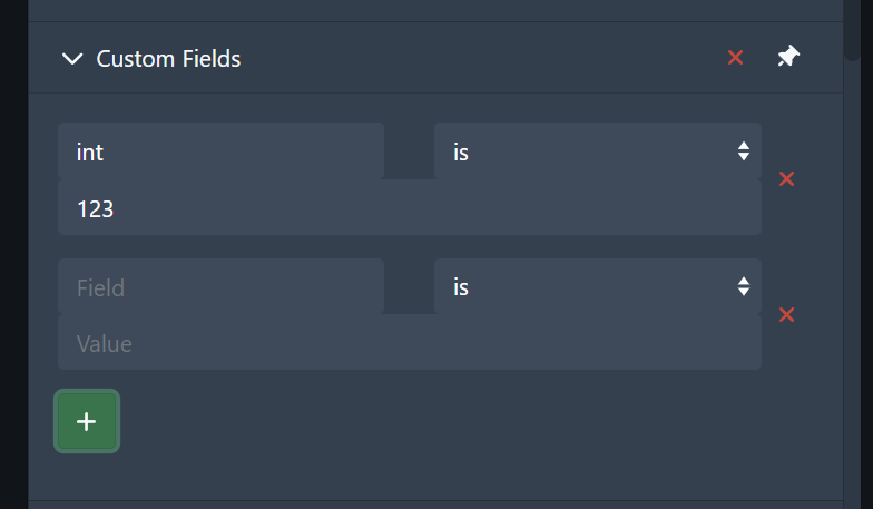
Here’s the current state of the custom field filtering UI:
The filter tag for the above filter is currently formatted as:
int (custom field) is 123 (+1 others)
The +1 others indicates the number of other custom fields in filter. In future, I’d like to separate the custom field filter tags, but that will take another chunk of time.
Before finishing up for the day, I discovered an issue where numeric values aren’t being filtered correctly, so the filter shown above isn’t actually working correctly. Tomorrow’s job will be to track this down and fix it in the PR.
My only advice is to always avoid reinventing the wheel in terms of UI/UX. Find what you’re implementing in the Material Design or iOS style guide, and copy that. They’re paying a professional UI team millions to get it right and are doing all the heavy lifting for the rest of us
I love this kind of post! Always interesting to see what goes into developing a new feature like this and learning more about the architectural style of Stash. I’m going to play around with these custom fields and leave feedback on the PR itself if I find something actionable beyond what’s already been reported in #code-review on Discord
Good advice, though having had a poke around the Material Design guide I haven’t found anything particularly relevant to this functionality.
Thanks for the kind feedback! I have wanted to do a dev diary type thing for a little while, but I never settled on a good place to do it. Here seems like a good place, and hearing feedback like this helps encourage me to add more. I don’t want it to be a self-indulgent exercise
Their filters are similar to Stash in that, it requires an
filter item aka identifier
modifier options aka relative property
filter item value(s) (if applicable)
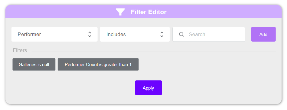
Their concept is more compact because all the items that make up a filter are found in drop down select forms. For example, I prototyped something really quick:
The first drop down select contains all the filter items, and could just as well be a search drop down select for convenience. In the above example I used a Performers filter item. This selected filter item dynamically changes the subsequent drop down selects to correspond with the modifiers and values requires for it.
The next drop down select shows the modifiers, include or exclude.
The final drop down select shows a drop down search select of the performer names in the db.
I think this would work for the new custom fields too, no? Can the custom fields filter items be presented as name (custom field)?
Still learning my way through Discourse; sorry for the delay in following up.
@WithoutPants, looking at the screenshot from your original design. I would recommend only keeping one of those input fields active at a time to prevent this area from getting too long too quickly. The red x can then change into a green check once the field has sufficiently been filled out. The big green plus button can also disappear. When a user hits the check, a pill will appear below the field boxes to display applied filters. Users can hit the x button on these pills to remove the filter or click the pill to edit it. The x button on the Custom Fields datatype can be used to clear all custom filters. The pills can also use a clear all button in the custom fields section. Once the Custom Fields section is closed, all the pills there will be moved to show at the bottom next to the other filter pills. I think the Custom Field pills should also appear last and should probably be styled slightly differently to distinguish them from filters on official Stash fields.
This is an awesome resource, and it will inform my thoughts on the filter UI redesign that I’m still planning. Thanks for this!
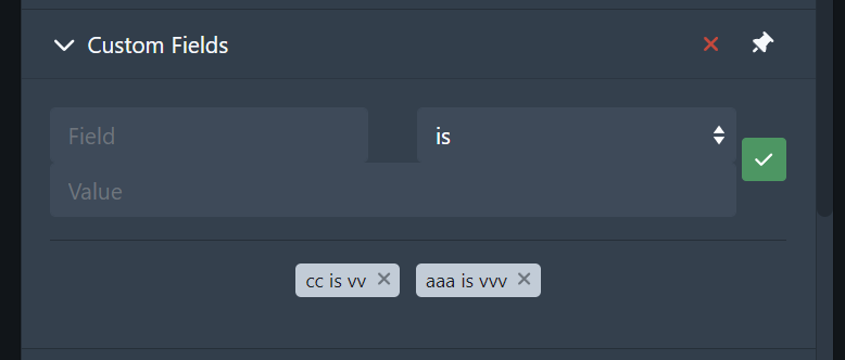
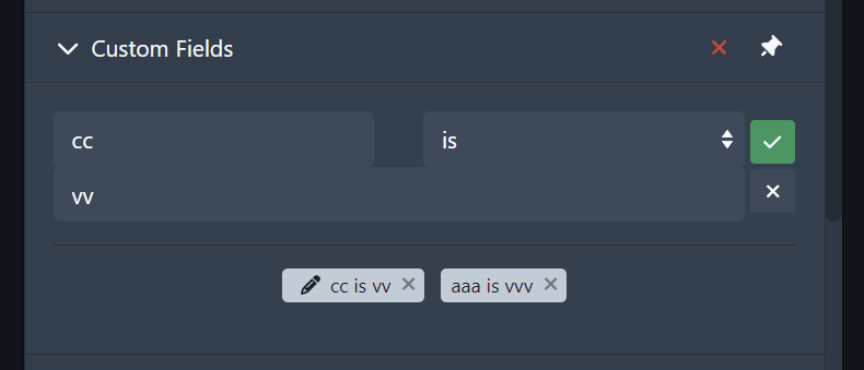
Thanks! I’m really beginning to hate the UI design aspect of stash development, so it’s good getting feedback from you guys. Here’s what I have currently:
This is what it looks like when no criterion are selected:
Selected criterion has the pencil icon. Clicking on the x button cancels the edit, emptying the fields. Clicking on the check button confirms the edit and empties the fields.
This is what the filter pill for custom fields currently looks like:
This is the temporary solution until I can change the way that the filter pills work.
This is what the filter pill for custom fields currently looks like:
This is the temporary solution until I can change the way that the filter pills work.
Got it.
The design looks much better, but the styling could still use some improvement. I assumed you were only looking for assistance with the design, but I can check out the branch and help with the CSS if you would like assistance there as well.