Greetings!
I created a feature request on GitHub to add O-Count to the performer page header. I then discovered that it would be a relatively easy change in the code, so I started attempting to implement the change.
However, I’m not sure where would be the best place to display the count! I came up with a few ideas, but I’m not sure which is best, because I think each of them has at least one pro and con. Here are some screenshots of places I tried placing it, please let me know if you have any feedback on them, or if you have any other ideas! (Btw, the alignment/styling might need some tweaking, these are just rough drafts. Once I know which version to pursue, I can polish the styling.)
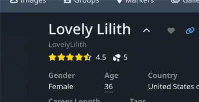
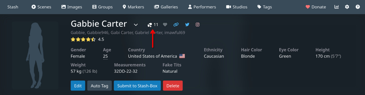
Option 1A
Pros:
- Doesn’t take up any extra vertical space
- I think this is relatively aesthetic
- The concept of ratings and O-Count are somewhat related, in the sense that they are both metrics of quality… sort of, so perhaps it makes sense to have them near each other
Cons:
- Slightly cluttered, but this could probably be improved with some CSS margin tweaks
- When using star ratings with less-than-full precision, moving your mouse over the stars causes the o-count to rapidly move back and forth horizontally, because the width of the rating number is changing. I was able to solve this by giving the rating number a min-width and making the rating number element always render (even if empty). It isn’t perfect, but I could probably make it better if I spent some time polishing the CSS.
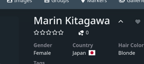
Option 1B
Pros:
- Doesn’t take up any extra vertical space
- I think this is relatively aesthetic
- The concept of ratings and O-Count are somewhat related, in the sense that they are both metrics of quality… sort of, so perhaps it makes sense to have them near each other
- Avoids the rating number size changing issue in Option 1A
Cons:
- Slightly cluttered, but this could probably be improved with some CSS margin tweaks
Option 2

Pros:
- Doesn’t take up any extra vertical space
- Grouped with other icon-based things
Cons:
- Because this wouldn’t be a button (clicking it wouldn’t do anything), but everything else in this toolbar is, that would be a little incongruent
- It would also be the only thing on the toolbar that is a datapoint
Option 3
Pros:
- Doesn’t take up any extra vertical space
- Grouped with other icon-based things
Cons:
- Because this wouldn’t be a button (clicking it wouldn’t do anything), but everything else in this toolbar is, that would be a little incongruent
- It would also be the only thing on the toolbar that is a datapoint
- I think O-Count is less significant than the Favorite button, so this order feels backwards to me
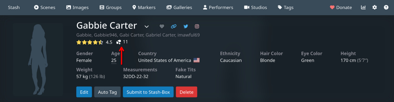
Option 4A
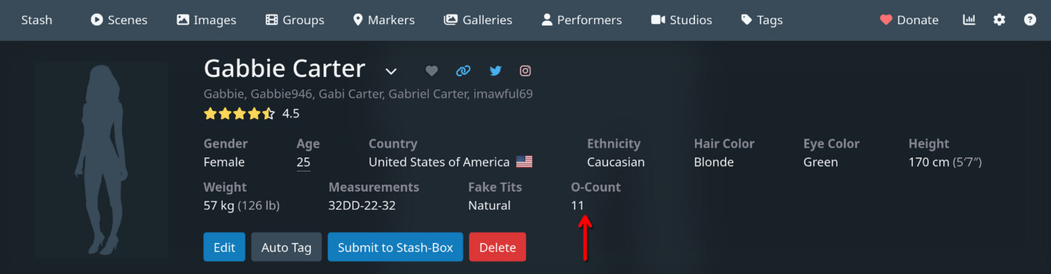
Pros:
- Simple and clean
Cons:
- This would be the only piece of data listed in the details section that would not be editable by the user by clicking Edit, so it would be slightly incongruent and new users may be confused about what it refers to
- Could potentially cause the detail section to take more vertical real estate, depending on the other visible attributes and the size of the screen, but I think the impact would be minimal
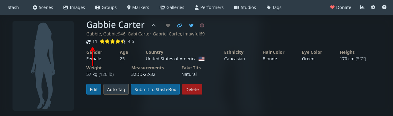
Option 4B
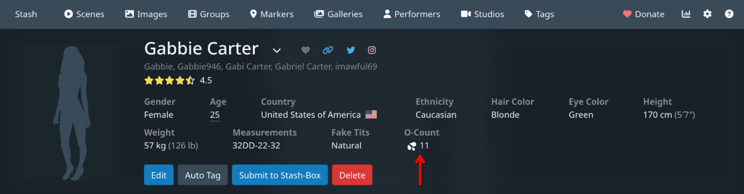
Pros:
- More obvious association with the functionality of the scene/image O-Count button than Option 4A (better for new users?)
Cons:
- This would be the only piece of data listed in the details section that would have an icon
- This would be the only piece of data listed in the details section that would not be editable by the user by clicking Edit, so it would be slightly incongruent and new users may be confused about what it refers to
- Could potentially cause the detail section to take more vertical real estate, depending on the other visible attributes and the size of the screen, but I think the impact would be minimal
So yeah, please let me know if you have any feedback or ideas! Thanks for your time!
(P.S. Congrats on v0.29!! ![]() )
)