main ← nexalapp:theme-neondark-refresh
opened 05:56PM - 04 Oct 26 UTC
A refresh of NeonDark for Stash v0.31, made inside the existing `Theme-NeonDark.…css` (no new stylesheet). It keeps the theme's identity: near-black ground, blue outlines on cards, buttons and nav boxes, a soft blue neon glow, centred card text, and the blue divider above card counts.
**What changed**
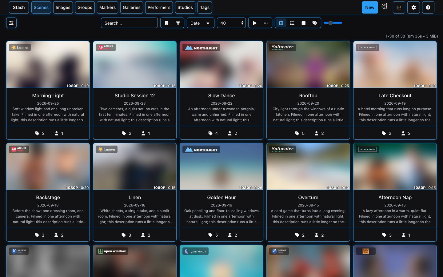
- **Colour:** the palette moves into variables at the top (one blue, `#2a9df4`, a lighter link blue, three text greys, one card radius). Primary actions (Edit, Save, New, dialog confirms) are filled blue with dark text so they pass WCAG AA; other buttons are outlined.
- **Top nav:** text centred in each outlined box, words only on desktop, brand reads "Stash".
- **Toolbar (Stash v0.29+):** outlined segments share a 34px height; the filter-sidebar toggle no longer touches the page edge.
- **Pagination:** centred with the result count on the same row; the floating bottom pagination is kept.
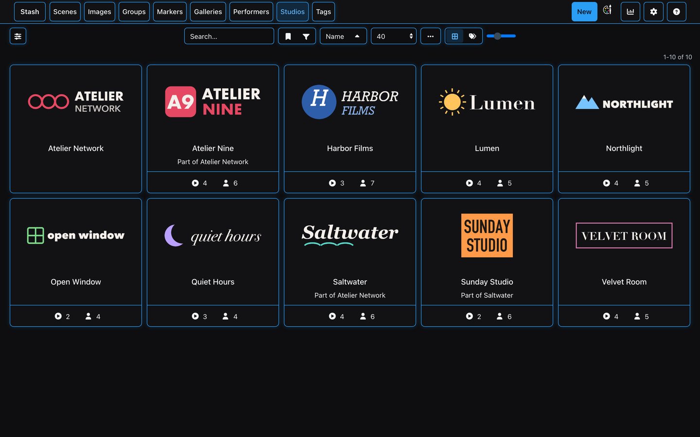
- **Cards:** glow on hover, a blue ring when selected; studio chip top-left; "1080P · 0:21" bottom right; one divider above the counts (the card's `<hr>` doubled it), pinned to the bottom so they line up across a row; the favourite heart matches the select checkbox; studio and tag logos sit in a 16:9 box instead of being squashed; performer portraits are 2:3. The card size slider works again for performers and galleries (the old theme forced their width).
- **Home page:** carousel arrows sit inside the page and are centred on the cards; every card in a row is the same height.
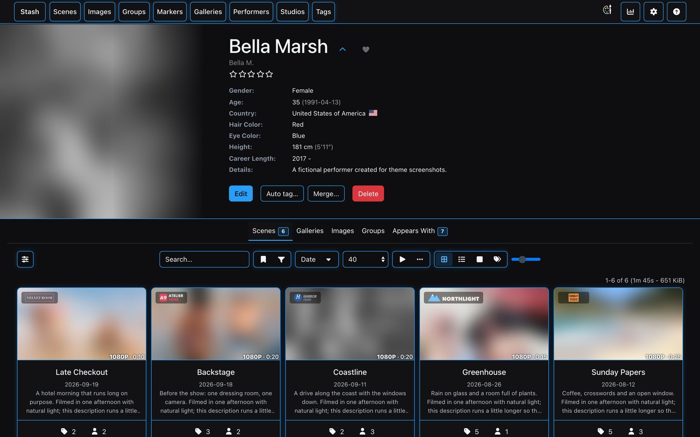
- **Performer page:** full-bleed portrait fading into the header.
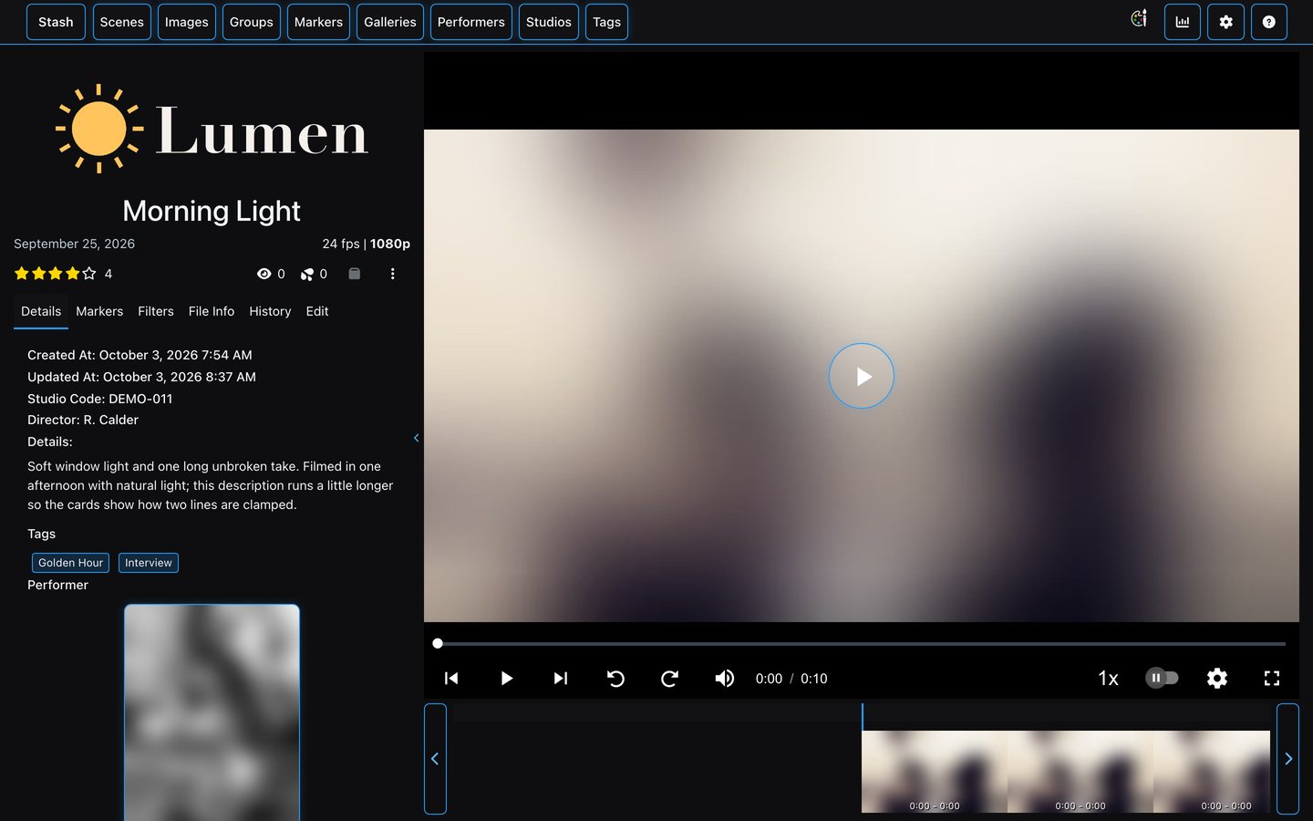
- **Scene page:** 32px title, blue scrubber, a circle behind the big play button; performers in the details panel are two per row at a normal size (they were stretched to half the window).
- **Settings:** active item filled blue; Theme Switch sections keep their full outline.
Version 1.0 → 2.0. README gains a short description and screenshots.
**Since this PR was opened**
- Fixes from a review across all the refreshed themes: home carousel arrows inside the page and centred on the cards, the card heart the same size as the select checkbox, two performers per row in the scene details panel.
- Home page studio cards fill their carousel slot; the task queue and the last stock-blue leaks are themed.
- Home carousels show whole cards only, spaced like the grid, and card shadows are no longer clipped into a band.
- The active tab's underline sits on the tab bar line instead of floating above it.
- The slim header Stash pins on scrolled detail pages has a solid background and slides in only once the full header has scrolled away (it used to overlap it).
- Phones: the filter sidebar opens as a full-screen sheet with a full-width results button (side by side with a single column of cards on small tablets); long Stash IDs fit the performer header.
- Dialogs such as Edit filter fill the screen on phones, with their buttons at the foot.
- Phones: the ☰ menu is an even grid of tiles with small icons, and the list toolbar fits on two rows.
- The ☰ button is the same colour as the nav icons beside it.
- The Theme Switch menu is solid and on the theme's colours (it was see-through over the blurred bar, and on stock slate).
- Phones: the page starts below the top bar (the list toolbar sat 8px under it).
### Screenshots
Taken on an empty Stash v0.31.1 with demo content: fictional titles and names, and openly licensed photos blurred heavily so no one is identifiable (credits on the [screenshots branch](https://github.com/nexalapp/CommunityScripts/tree/screenshots)).
| Scenes | Scene |
|---|---|
|  |  |
|  |  |
<img src="https://raw.githubusercontent.com/nexalapp/CommunityScripts/9e5af6906ecfd075b50273c43df7b63da0eb1e31/Theme-NeonDark/mobile-scenes.jpg" alt="Scenes on a phone" width="240"> <img src="https://raw.githubusercontent.com/nexalapp/CommunityScripts/9e5af6906ecfd075b50273c43df7b63da0eb1e31/Theme-NeonDark/mobile-scene.jpg" alt="A scene on a phone" width="240">
### Testing
Tested on Stash v0.31.1 (Docker) in Chrome at 1440×900 and 390×844, on a real library of several thousand scenes and on an empty instance with demo content: home carousels, scene, performer, studio and tag grids with the size slider, the filter sidebar and selection toolbar, scene, performer and studio pages, settings and the Theme Switch menu. Validated with `node validate.js --ci`.
### AI disclosure
This change was written with Claude (Anthropic) in Claude Code, from a design mockup. I reviewed the code and tested it on my own Stash install before submitting.
🤖 Generated with [Claude Code](https://claude.com/claude-code)